The grid-column-end CSS property is part of the CSS Grid Layout specification, used to indicate the column grid line where a grid item ends in a grid layout. This property — among other line-based placement grid properties — controls the size of a grid item and where it sits on the grid.
.grid-container {
  display: grid;
  grid-template-columns: 1fr 1fr 1fr;
}

.grid-item:nth-child(2) {
  grid-column-end: 4; /* Item ends on the third column line */
}
Based on CSS Grid’s default auto-placement behavior, the second child element of the grid in this example is placed in the second column. But we declared a grid-column-end position on the fourth grid line, moving the grid item into the third column and aligning its ending edge with the fourth grid line.
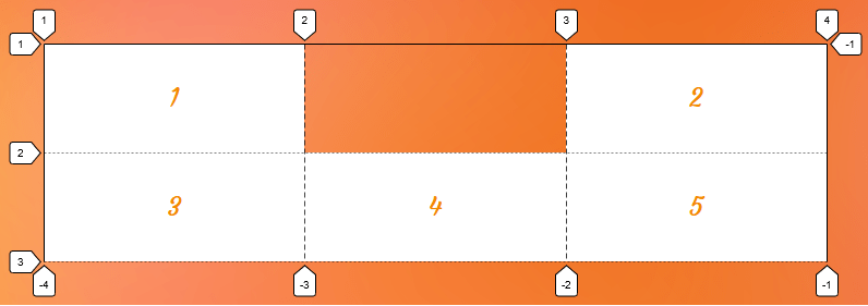
grid-column-end CSS Grid propertySyntax
grid-column-end: <grid-line>;Full definition
where
<grid-line> =
  auto |
  <custom-ident> |
  [ [ <integer [−∞,−1]> | <integer [1,∞]> ] && <custom-ident>? ] |
[ span && [ <integer [1,∞]> || <custom-ident> ] ]- Initial value:
auto - Applies to: grid items and absolutely-positioned boxes whose containing block is a grid container
- Inherited: no
- Computed value: as specified
- Animation type: discrete
Values
/* Keyword value */
grid-column-end: auto;

/* <custom-ident> value */
grid-column-end: myLineName;
grid-column-end: myGridArea;

/* <integer> + <custom-ident> values */
grid-column-end: 3;
grid-column-end: -2;
grid-column-end: main-area 2;
grid-column-end: 3 sidebar-start;

/* span + <integer> + <custom-ident> values */
grid-column-end: span 3;
grid-column-end: span main;
grid-column-end: span myarea 5;

/* Global values */
grid-column-end: inherit;
grid-column-end: initial; /* same as `auto` */
grid-column-end: revert;
grid-column-end: revert-layer;
grid-column-end: unset;
auto
This is the default value. It indicates the default span (1) and auto-placement behavior, which means the grid item is automatically placed in the next available empty grid cell.
<custom-ident>
This syntax allows you to either use an integer to refer to a numbered grid line or a string to refer to a named grid line or a named grid area. In other words, you can specify a grid line by its numerical index or name to the ending edge of a grid item.
Positioning items by line numbers
There are two grid lines before and after each grid track with a numerical index assigned to them automatically, starting from number one.
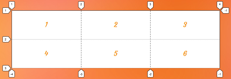
In the first example of this article, we used this syntax to refer to the fourth grid line by its index (4) to align the ending edge of the grid item with the starting edge of the third column using <custom-ident> syntax:
.grid-item:nth-child(2) {
  grid-column-end: 4;
}
You can also use a negative number to refer to a grid line, but remember that it counts starting from the ending edge of the grid. The following code points to the same grid line in the previous example but counts in reverse:
.grid-item:nth-child(2) {
  grid-column-end: -1; /* same as 4 */
}
Notice the negative integers are assigned to our grid as well as positive ones:

grid-column-end CSS Grid propertyPositioning items by line names
You can assign a custom name to a grid line using grid-template-columns and grid-template-rows and use line-based placement grid properties to refer to that line by its name.
Let’s go back to our example and name all its column track lines like the following declaration:
.grid {
  display: grid;
  grid-template-columns: [first] 1fr [second] 1fr [third] 1fr [last];
}
We can refer to the fourth line by our custom name instead of its index:
.grid-item:nth-child(2) {
  grid-column-end: last; /* same as index number 4 */
}
Note that the <custom-ident> cannot take the span value since span is a reserved keyword for grid placement properties (e.g. grid-column: 1 / span 2).
Positioning items by grid areas
When defining grid areas using the grid-template-areas property, you get implicit line names for free based on the name of the areas. For instance, a grid area with the name sidebar generates a line name sidebar-start before it and a sidebar-end after it. You can refer to these lines to set the position of a grid item.
.grid-item:nth-child(2) {
  grid-column-end: sidebar-end;
}
Alternately, you can refer to the area’s name to position an item at the end line of the sidebar named area:
.grid-item:nth-child(2) {
  grid-column-end: sidebar;
}
Since we are using the grid-column-end property in this example, the browser understands that we want the sidebar-end line of the sidebar area; therefore, it will align the grid item’s ending edge with the grid area’s ending edge.
Here is a complete example:
<body>
  <main></main>
  <aside></aside>
</body>
body {
display: grid;
grid-template-columns: 1fr 1fr 1fr;
grid-template-areas: "main main sidebar";
}
aside {
grid-column-end: sidebar-end;
}This sets the position of the aside element to the sidebar area in our grid.
<integer> && <custom-ident>?
This syntax allows you to position grid items by grid lines when there are repeated names. If there are grid lines with the same name, this syntax helps specify which of those lines you are referring to.
.grid {
  display: grid;
  grid-template-columns: [bar] 1fr [foo] 1fr [bar] 300px [bar];

  /*
    Using repeat() function also gives you repeated named grid line, for example:
    grid-template-columns: repeat(3, [bar] 1fr);
  */
}
Let’s assume you want to choose the fourth line, but that line has the same name as the first, and the third grid lines — all of them are called bar. Since the third line named bar is the fourth line you can use 3 to select it as the ending point:
.grid-item:nth-child(2) {
  grid-column-end: 3 bar; /* The third `bar` named line which is the fourth line */
}
Note that the order doesn’t matter, so we can also write the previous code like this as well:
.grid-item:nth-child(2) {
  grid-column-end: bar 3;
}
Like the previous syntax, you can also use a negative integer to count the grid lines starting from the end edge of the grid. In our example, if we want to refer to the first barWe can count starting from the ending edge of our grid and write it like this:
.grid-item:nth-child(2) {
  grid-column-end: -3 bar;
}
Note that the integer value cannot be zero.
span && [ <integer> || <custom-ident> ]
This syntax allows a grid item to span across the grid tracks. It can be specified in three different ways.
Note that if the integer is not specified anywhere in this syntax, the default value is 1.
span <integer>
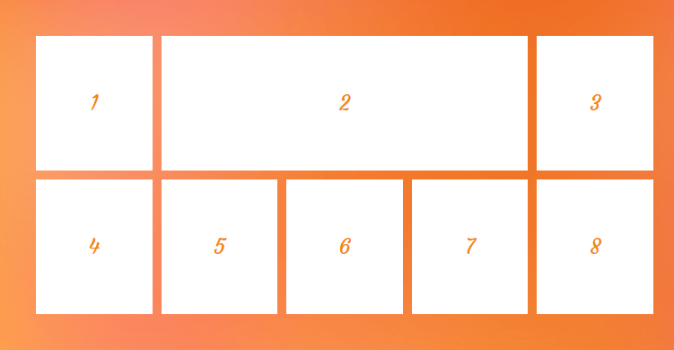
Using the span keyword followed by an integer indicates the number of tracks a grid item spans from a specific grid line. For example, if we want a grid item to span three column tracks towards its ending edge, we can apply the following value:
.grid-item:nth-child(2) {
  grid-column-end: span 3;
}
grid-column-end property.span <custom-ident>
You can combine span with a name of a grid line to make the grid item expand until it reaches that specified grid line.
.grid-item:nth-child(3) {
  grid-column-start: 3;
  grid-column-end: span lastline;
}
Since the starting line of the grid item is known (3) we can span the item towards the end line until it hits a grid line named lastline.
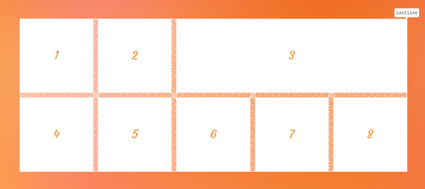
grid-column-end property.span <custom-ident> <integer>
If the specified grid line name is assigned to more than one grid line — in other words, if we have repeated named grid lines — we need to say which ones we want to target. To do that, we can add an integer to our value specifying which grid line we are referring to.
Take the following grid as an example:
.grid-container {
  display: grid;
  grid-template-columns: [y] 1fr [x] 1fr [x] 1fr [y] 1fr [x] 1fr [x];
}

.grid-item:nth-child(3) {
  grid-column-start: 2;
  grid-column-end: span x 2;
}
We set the starting line of the grid item to the second line. Then we want it to span forward until it hits a grid line named x. And since we want it to be the second x grid line, we wind up with grid-column-end: span x 2.
As a result, our grid item starts spanning toward the ending line from the second line, as illustrated below. The first line that it hits is the first x, next is named y, and finally, it hits the desired second line named x.
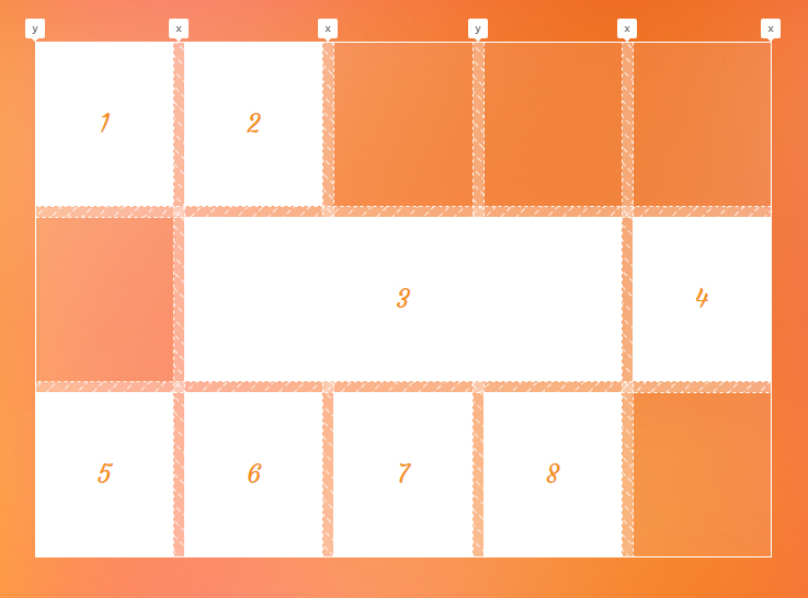
x named line using the grid-column-end property.This syntax is helpful when you want to span a grid item towards a grid line using its name, but you are aware that there is more than one grid line with that name, so we add an integer to say we want the N of that grid line.
Positioning grid items may generate implicit tracks
Setting the position of a grid item to a grid line’s index or a grid line’s name that does not exist in an explicit grid will force the grid to create implicit tracks to add that position to the grid.
Let’s create a grid with two columns and set the position of its item to non-existent lines. In the following example, we have only two columns, and we didn’t name any of our gird lines. So, there is no line with an index of 5 and no line with the name of test, but we set these values to our properties:
.grid {
  display: grid;
  grid-template-columns: 1fr 1fr;
  grid-auto-columns: 100px;
}

.grid-item {
  gird-column-start: span test;
  grid-column-end: 5;
}
Since we know there are implicit tracks in our grid, and we want them to have a size so we can see them, we add the grid-auto-columns property to our code.
Now that we have everything set up, let’s see what happens to our grid:
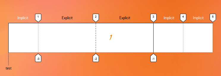
We set grid-column-end to 5, but the last index of our explicit grid is 3, and because of that, two implicit tracks are created towards the end of the grid to give us a line with an index of 5. On the other hand, we set the grid-column-start to a grid line with the name of test. Again, since we don’t have such a name in our grid and because we want that grid line to align with the starting edge of our grid item, an implicit column track gets created on the starting side of the explicit grid in the inline direction, and its line is test.
Positioning grid items may cause holes.
As you may have seen in the previous examples, line-based positioning can cause empty spaces between grid items.
If those holes are unwelcome in your design, we can handle them easily by applying the grid-auto-flow property with the dense value to the grid container.
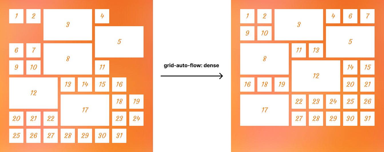
grid-auto-flow property can fill empty spaces caused by line-based positioning.Stacking grid items
When positioning items across the grid, we can stack or overlap them on top of each other. This gives us the ability to sometimes use CSS Grid as an alternative to absolute positioning. For instance, we can put a caption layer on top of an image without using the position property as demonstrated below:
<figure>
  <img src="image.png" alt="how dare you leave alt empty?">
  <figcaption>The caption of our image</figcaption>
</figure>
figure {
display: grid;
}
img,
figcaption {
grid-column-start: 1;
grid-column-end: -1;
grid-row-start: 1;
grid-row-end: -1;
}Here’s what we get:

By default, grid items stack in the source order, but we can control their level using the z-index property. In the following example, we overlap some items, and we use the z-index property to bring the second item to the highest level:
.item:nth-child(2) {
  grid-column-start: 2;
  grid-column-end: 4;
  grid-row-start: 2;
  grid-row-end: 4;
  z-index: 1;
}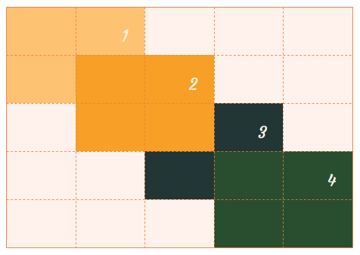
z-index property.Using a negative index for more flexibility
There are cases where you want a full-width item in your grid, meaning it starts from the first grid line and ends with the last one. For example, in a four-column grid, the end line index is 5, so you can write the code below to have your full-width item.
.grid-container {
  display: grid;
  grid-template-columns: repeat(4, 1fr);
}

.grid-item.full-width {
  grid-column-start: 1;
  grid-column-end: 5;
}
It works like a charm, but what if the number of columns changes to six? In that case, we need to update the index value for the placement property.
The flexible solution is to use the negative index!
.grid-item.full-width {
  grid-column-start: 1;
  grid-column-end: -1;
}
Now, no matter how many columns we have, the grid item with the full-width class always stretches across the grid.
Grid line indexes depend on the writing mode.
The whole module of grid layout is based on the writing mode of the document; hence, grid lines depend on the direction and writing mode as well. For example, in a right-to-left language like Persian and Arabic, the first grid line with an index of 1 is the right-most line in a grid.
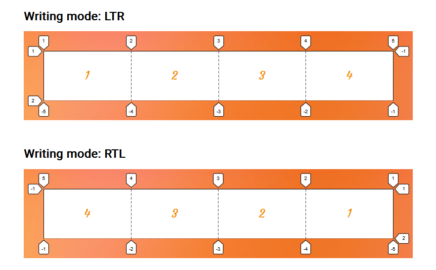
So, take the writing direction of your grid into account when using a grid line index to position grid items using a property like grid-column-end.
Named areas win over named lines.
If a named grid area has the same name as a line name, the placement algorithm will prefer to use the named grid area’s lines.
Consider the following example:
.container {
  display: grid;
  grid-template-columns: 1fr [y] 1fr 1fr 1fr 1fr;
  grid-template-areas: "x x x y y";
}
The second grid line is named y, and the last two columns are defined as an area with the same name. Now, to position the first grid item, we assign y as the value for grid-column-end. Let’s see which line it will refer to:
.grid-item:first-child {
  grid-column-end: y;
}
As you can see in the next image, although the y line is closer to the first item, the browser chose the grid area’s edge to place the ending edge of the item.

y, and the browser selects the grid area line over the named grid line when that name is assigned using grid placement properties.Note that this doesn’t apply if you use the implicit name line of a grid area. For instance, let’s change the name of the grid line in the previous example to y-end. Also, we know that the area with the name y has an implicit y-end grid line assigned. Now, if we set y-end to the grid-column-end, the grid named line will be the winner this time.
.container {
  display: grid;
  grid-template-columns: 1fr [y-end] 1fr 1fr 1fr 1fr;
  grid-template-areas: "x x x y y";
}

.grid-item:first-child {
  grid-column-end: y-end;
}
Accessibility
One thing to note when using the grid placement properties is the issue caused by rearranging the items. When you change the position of an item, only the visual order of the grid items changes, and that order might not be the same as the original document order. This may cause a very bad experience for someone tabbing through the document on a keyboard or listening to a screen reader that reads the content in the same order as the HTML.
So, avoid changing the order of grid items when the HTML order of the elements matters. For example, it can be good for a random image gallery but perhaps not so much for your form inputs.
However, at the time of this writing, there is a proposal to tackle this issue that will hopefully resolve this concern in the future.
Demo
You can change the value of grid placement properties in the demo to see what happens to the third grid item:
Browser support
Related tricks!
CSS Grid Starter Layouts
A Collection of Interesting Facts about CSS Grid Layout
Breaking Out with CSS Grid Explained
Breaking the Grid
Building a Conference Schedule with CSS Grid
Simple Named Grid Areas
Related guides
More information
- CSS Grid Layout Module Level 1 (W3C)
- CSS Grid Layout: Introduction (DigitalOcean)
- Placing, Spanning, and Density in CSS Grid (DigitalOcean)
Related
display
.element { display: inline-block; }
grid-auto-columns
.element { grid-auto-columns: minmax(100px, 200px); }
grid-auto-flow
.element { grid-auto-flow: dense; }
grid-auto-rows
.element { grid-auto-rows: minmax(1fr, 500px) 3fr; }
grid-column-start
.element { grid-column-start: 3; }
grid-template
.element { grid-template: 100px 1fr / 300px 1fr; }
grid-template-areas
.element { grid-template-areas: "header header" "sidebar main"; }
grid-template-columns
.element { grid-template-columns: 300px 1fr; }
grid-template-rows
.element { grid-template-rows: minmax(auto, 1fr) 3fr; }
