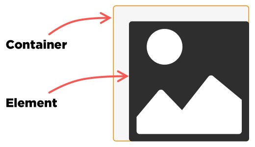
The CSS property object-position is used to align any selected replaced element (e.g., an <img>) within the box that contains it.
img {
  object-position: right bottom;
}
<img> element will align to bottom-right edge of its parent container with object-position: right bottom;.While it’s probably most common to see object-position used on <img> elements, it can be used on other types of replaced elements, like <iframe>, <video>, and <embed>.
object-position is part of the CSS Images Module Level 3 specification.
Syntax
object-position: <position>where <position> = [ [ left | center | right ] || [ top | center | bottom ] | [ left | center | right | <length-percentage> ] [ top | center | bottom | <length-percentage> ]? | [ [ left | right ] <length-percentage> ] && [ [ top | bottom ] <length-percentage> ] ]where <length-percentage> = <length> | <percentage>That’s just a really long way of explaining that we can use keywords or length values to set an element’s alignment within a container.
Values
/* Positional values */
object-position: 50% 50%; /* default position */
object-position: right bottom;
object-position: 20px 95px;
object-position: center 20px; /* mix and match */
object-position: 60% top; /* mix and match */

/* Global values */
object-position: inherit;
object-position: initial;
object-position: unset;
Examples
Let’s look at a few different examples of the object-position property at work.
Basic usage
Details
The example above demonstrates on how object-position aligns an image element relative to its parent container when the image is smaller than the parent container. Again, note the use of object-fit: none in there to make object-position work.
Image exceeds the container
Details
This demo demonstrates how an image element that is larger than its parent container behaves with different object-position values.
Other types of replaced content
Details
This example shows object-position used with other types of replaced content, including <video> and <iframe>.
Tricks!
Responsive image crop
The example below has a basic responsive layout with image above text. Perhaps the man in this image is the subject of the article, and as the screen size gets smaller, we want to maintain focus on that subject. object-position is used here to maintain that focus, cropping the image at a particular break point with object-position: left bottom.
Mosaic faces
Outside of positional focus, object-position’s practical uses are limited. However, it is a property you can get somewhat creative with when it comes to page layout and design.
Stylized borders
Another cool thing we can do is use the negative space of the parent container to draw fake borders. We set a background color on the parent container, drop in an image that’s smaller than the container, then use object-position to align the image. What’s left sorta looks like a border. It gets super interesting when we start putting many containers together because it looks as though a line is drawn between them, which can make neat patterns.
Browser Support
This browser support data is from Caniuse, which has more detail. A number indicates that browser supports the feature at that version and up.
Desktop
| Chrome | Firefox | IE | Edge | Safari |
|---|---|---|---|---|
| 32 | 36 | No | 79 | 10 |
Mobile / Tablet
| Android Chrome | Android Firefox | Android | iOS Safari |
|---|---|---|---|
| 123 | 124 | 4.4.3-4.4.4 | 10.0-10.2 |

function example() {
element.innerHTML = “what the hell?”;
}
The browser support is wrong for Safari, which doesn’t support
object-positionat all.http://caniuse.com/#search=object-position
Thanks Marek, I’ve updated the post with the right info now.
Safari 10 supports object-position:
https://developer.apple.com/library/prerelease/content/releasenotes/General/WhatsNewInSafari/Articles/Safari_10_0.html
(Also, the codepen is a 404 now)
Safari 10 (macOS and iOS) now properly support both
object-fitandobject-position.I’m a bit late here, but I have an amend: third example should say
object-position: 100% 100%(instead of 100% 150%), while fourth one should sayobject-position: 0 100%(instead of 0 150%).No mention that you can use same notation as background-position
‘object-position: left bottom;’
I have a full screen image on my website. I want it to adapt based on the screen resolution/ratio but I have some constrains:
I always have to see the right part of the image (only crop what is
on the left)
I cannot crop the height.
I have tried without any success to use:
text-indent: -100%;
object-position: right;
object-fit: contain;
but no combination works.
Thank you for any help