The float property in CSS is used for positioning and layout on web pages. A common usage might be floating an image to one side and letting text wrap around it.
.intro-img {
  float: left;
}
Syntax
float =
  block-start      |
  block-end        |
  inline-start     |
  inline-end       |
  snap-block       |
  <snap-block()>   |
  snap-inline      |
  <snap-inline()>  |
  left             |
  right            |
  top              |
  bottom           |
  none             |
  footnote

<snap-block()> =
  snap-block( <length> , [ start | end | near ]? )

<snap-inline()> =
snap-inline( <length> , [ left | right | near ]? ) - Initial value:
none - Applies to: all elements, but has no effect if the value of
displayisnone. - Inherited: no
- Computed value: as specified
- Animation type: discrete
Values
/* Keyword values */
float: left;
float: right;
float: none;
float: inline-start;
float: inline-end;

/* Global values */
float: inherit;
float: initial;
float: revert;
float: revert-layer;
float: unset;none: the element does not float. This is the initial value.left: floats the element to the left of its container.right: floats the element to the right of its container.inline-start: the logical equivalent ofleftbased on thewriting-mode.inline-end: the logical equivalent ofrightbased on thewriting-mode.
An element that is floated is automatically display: block;
What does “float” mean?
To understand the purpose and origin of float, we can look to print design. In a print layout, images may be set into the page such that text wraps around them as needed. This is commonly and appropriately called “text wrap”. Here is an example of that.
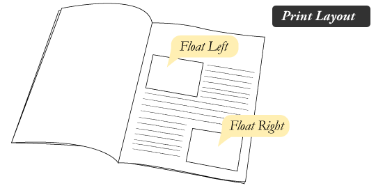
In page layout programs, the boxes that hold the text can be told to honor the text wrap, or to ignore it. Ignoring the text wrap will allow the words to flow right over the image like it wasn’t even there. This is the difference between that image being part of the flow of the page (or not). Web design is very similar.
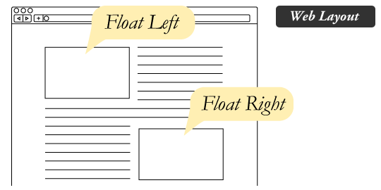
In web design, page elements with the CSS float property applied to them are just like the images in the print layout where the text flows around them. Floated elements remain a part of the flow of the web page. This is distinctly different than page elements that use absolute positioning. Absolutely positioned page elements are removed from the flow of the webpage, like when the text box in the print layout was told to ignore the page wrap. Absolutely positioned page elements will not affect the position of other elements, and other elements will not affect them, whether they touch each other or not.
Demo
This demo shows an article with two images: one set to float: left, and one set to float: right. Press the “toggle floats” button to toggle the floats off and on.
Floats for layout
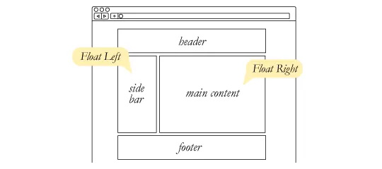
Aside from the simple example of wrapping text around images, floats can be used to create entire web layouts.
Floats are also helpful for layout in smaller instances. Take for example this little area of a web page. If we use float for our avatar image, when that image changes size the text in the box will reflow to accommodate it:

This same layout could be accomplished using relative positioning on the container and absolute positioning on the avatar as well. But, when it’s done that way, the text would be unaffected by the avatar, and would not be able to reflow on a size change.

Demo
This demo shows an avatar with float: left applied. Press the “toggle image size” button to see a wider version of the avatar image. Notice that the text reflows to accommodate the image instead of running over the image.
Clearing the float
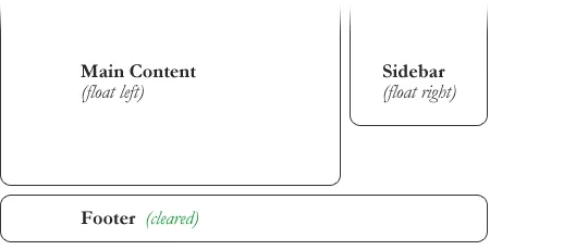
Float’s sister property is clear. An element that has the clear property set on it will not move up adjacent to the float like the float desires, but will move itself down past the float. Again an illustration is more helpful than words:
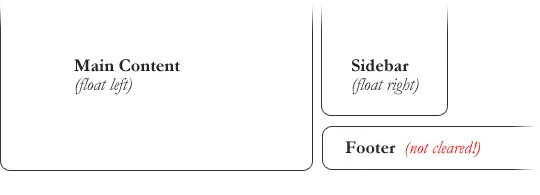
In the above example, the sidebar is floated to the right and is shorter than the main content area. The footer then is required to jump up into that available space as is required by the float. To fix this problem, the footer can be cleared to ensure it stays beneath both floated columns.
#footer {
  clear: both;
}
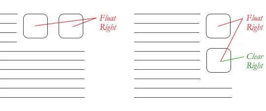
Clear has four valid values as well. The value both is most commonly used, which clears floats coming from either direction. The values left and right can be used to only clear the float from one direction respectively. The initial value is none, which is typically unnecessary unless it’s used to explicitly remove a clear value that has been set. The value inherit makes the element inherit its parent’s clear value. Strangely, Internet Explorer did not support this value until IE8.
Clearing only the left or right float, while less commonly seen in the wild, definitely has its uses.
The great collapse
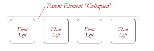
One of the more bewildering things about working with floats is how they can affect the element that contains them (their “parent” element). If a parent element contains nothing but floated elements, its height collapses to nothing. This isn’t always obvious if the parent doesn’t contain any visually noticeable background, but it is important to be aware of.
As counterintuitive as collapsing may seem, the alternative is worse. Consider this scenario:
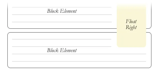
If the block element on top were to have automatically expanded to accommodate the floated element, we would have an unnatural spacing break in the flow of text between paragraphs, with no practical way of fixing it. If this were the case, we designers would be complaining much harder about this behavior than we do about collapsing.
Collapsing almost always needs to be dealt with to prevent strange layout and cross-browser problems. We fix it by clearing the float after the floated elements in the container but before the close of the container.
Techniques for clearing floats
If you are in a situation where you always know what the succeeding element is going to be, you can apply the clear: both; value to that element and go about your business. This is ideal as it requires no fancy hacks and no additional elements making it perfectly semantic. Of course things don’t typically work out that way and we need to have more float-clearing tools in our toolbox.
- The Empty Div Method is, quite literally, an empty div
<div style="clear: both;"></div>. Sometimes you’ll see a<br />element or some other random element used, but div is the most common because it has no browser default styling, doesn’t have any special function, and is unlikely to be generically styled with CSS. This method is scorned by semantic purists since it has no contextual meaning to the page and is there purely for presentation. Of course, in the strictest sense, they are right. But, it gets the job done and doesn’t hurt anybody. - The Overflow Method relies on setting the
overflowCSS property on a parent element. If this property is set toautoorhiddenon the parent element, the parent will expand to contain the floats, effectively clearing it for succeeding elements. This method can be beautifully semantic as it may not require an additional elements. However, if you find yourself adding a newdivjust to apply this, it is equally as un-semantic as the emptydivmethod, and less adaptable. Also bear in mind that the overflow property isn’t specifically for clearing floats. Be careful not to hide content or trigger unwanted scrollbars. - The Easy Clearing Method (otherwise known as “clearfix”) uses a clever CSS pseudo selector (
:after) to clear floats. Rather than setting the overflow on the parent, you apply an additional class like “clearfix” to it. Then apply this CSS:
.clearfix:after {
  content: "";
  visibility: hidden;
  display: block;
  height: 0;
  clear: both;
}
This will apply a small bit of content, hidden from view, after the parent element which clears the float. This isn’t quite the whole story, as additional code needs to be used to accomodate for older browsers.
Also see this snippet which keeps track of the latest and greatest in clearfixes, including the newer “micro clearfix.”
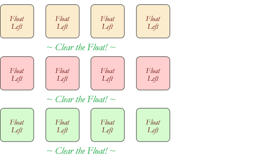
Different scenarios call for different float clearing methods. Take for example a grid of blocks, each of different types.

To better visually connect the similar blocks, we want to start a new row as we please, in this case when the color changes. We could use either the overflow or easy clearing method if each of the color groups had a parent element. Or, we use the empty div method in between each group. Three wrapping divs that didn’t previously exist or three after divs that didn’t previously exist. I’ll let you decide which is better.
Problems with floats
Floats often get beat on for being fragile. The majority of this fragility came from bugs in IE6 and IE7. As those browsers fade into the past, these bugs are fading along with them. But, it’s still worth understanding them if you ever need to debug an “OldIE”.
- Pushdown is a symptom of an element inside a floated item being wider than the float itself (typically an image). Most browsers will render the image outside the float, but not have the part sticking out affect other layout. Old versions of IE expanded the float to contain the image, often drastically affecting layout. A common example is an image sticking out of the main content push the sidebar down below.
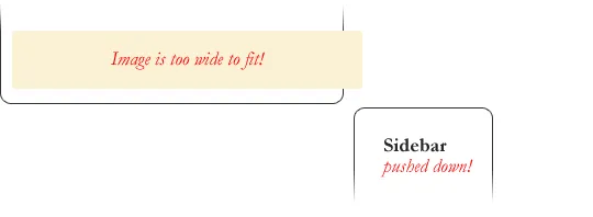
Quick fix: Make sure you don’t have any images that do this, useoverflow: hidden;to cut off excess. - Double Margin Bug — Another thing to remember when dealing with IE 6 is that if you apply a margin in the same direction as the float, it will double the margin. Quick fix: set
display: inlineon the float, and don’t worry it will remain a block-level element. - The 3px Jog is when text that is up next to a floated element is mysteriously kicked away by 3px like a weird forcefield around the float. Quick fix: set a width or height on the affected text.
- In IE 7, the Bottom Margin Bug was when if a floated parent has floated children inside it, bottom margin on those children is ignored by the parent. Quick fix: using bottom padding on the parent instead.
Alternatives
If you need text wrapping around images, there really aren’t any alternatives for float. Speaking of which, check out this rather clever technique for wrapping text around irregular shapes. But for page layout, there definitely are choices. Eric Sol has an article on A List Apart, Faux Absolute Positioning, which describes a very interesting technique that in many ways combines the flexibility of floats with the strength of absolute positioning.
CSS3 tackles page layout a couple of ways:
Absolutely positioned floats (e.g. you absolutely position as normal, but the element is still able to affect other elements, like have text wrap around it) were discussed, but I think the idea was shelved due to similarities to other more robust layout ideas.Video
I did a screencast a while back explaining many of these float concepts.
Browser support
| Chrome | Safari | Firefox | Opera | IE | Android | iOS |
|---|---|---|---|---|---|---|
| All | All | All | All | All | All | All |
More information
- CSS 2.2 Specification (
floatproperty definition) - CSS Logical Propeties and Values, Level 1 (
floatlogical property values) floatat MDN

nice article, thanks a lot!
Dude thanks sooo much, really awesome article. It totally helped me visualize how float works. Im the kind of person who benefits from graphical presentation of technique more so then just boring texts.
Thanks
Bala
Hi, just wondering about how to handle block elements that have a background-image or bottom-border for example – these design aspects do not wrap and are making my design life more difficult. I assume there is no solution – but I thought I would ask the master! Any thoughts on this float issue?
Nice stuff. One other issue with floats I’ve encountered (similar to the 3px jog maybe?) is in trying to indent a paragraph alongside another – for instance, in laying out a theater or movie script, where you may want the speaker’s name on the left, and the actual speech to its right, and you hate using tables.
Applying float: left to the speaker element and, say, margin-left: 70px to the following speech element results in progressive jogging of the speaker downwards with each successive line, at least in Chrome and IE. Irritatingly, this jog does not show up in the Visual Studio designer…
Quick fix: set a margin-bottom: 0px; on both elements, and a clear:both on the speaker. The bad news: it will look fine in the browser and completely wrong in the VS designer (sigh)… :)
I am wondering in the grid type layout where I want two rows of three boxes each is float left or inline-block a better option? Not ready to try a grid yet ;)
Thank you for your most comprehensive CSS knowledge.
I wish you the best!
elmoluz
Float vs. Floating… Can a ‘float’ trick satisfy text wrap around something floating? Floating is where, as page scrolls up and down, something is always visible, floating in top right corner and stuff wraps around it? Compare here to another something floated or stuck top left corner of page… Note that since IE11 won’t float aside unless float is styled inline, we use tags
div.aside)(asideto help style the float.Layout is simple.
Element
article ( relativehugs all content, fills page. Elementsection ( -wrapsdiv.aside#leftnicely, but gets buried underdiv.aside#right.Say we use two aside elements.
Title block is
div.aside#leftand ad floater isdiv.aside#right.We code
aside ( border:1px position:relative width:100px.Top left float is
div.aside#left ( float:left margin-right:1em.Floater is
div.aside#right(position:absolute *ie6* position:fixed right:1em top:1em.Now, we need ‘ad aside’ always visible, top right corner of browser window! How can any variant of
asideusefloat:rightand not stick to top-of-page… and(visible top right corner as we scroll down) how can content wrap around our floater?
I am having a problem keeping my facebook like/share button in the centre of my webpage.
Can you help me with some css to stop it moving.
My css is :
.fb-like{position:fixed;padding:15px;margin:0 auto}
Regards.
Neil
I have been searching for a way to explain this to my students– you are amazing — thank you for this comprehensive explanation!!!
There’s another value, used for paged media, called
footnote. It’s implemented and works now in PrinceXML.On thing I’m finding confusing is using floats together with margin on neighboring elements. Let’s say you have an image floating left and text inside a div that describe the image, like this:
in this case the div will have 0 margin relative to the image. The only solution I’ve found is to set the margin on the image pushing neighboring elements away. I’m really interested if there exists other ways to tackle this problem.
The “bewildering” Great Collapse is a flaw in CSS. If it was not a flaw, there would be no need for special explanation. I am disappointed to see the energy of a leading voice in CSS used to rationalize the problem instead of fixing it.
Awesome article!
Perfect article! You have a gift and should be teaching on a university!
Thanks a lot! That’s the most coherent explanation of floats ever!
This article and site is a great find.
Just completed my first site using bootstrap and had to play around with the float of a image.
cool
I’m learning CSS floats and positioning and this is the best article I’ve found.
It has cleared all my doubts about float and clear properties.
Thanks a lot for this tutorial Sara.
Is it just me or is there a mistake in the picture under “Clearing the Float
Float’s sister property is clear. An element that has the clear property set on it will not move up adjacent to the float like the float desires, but will move itself down past the float. Again an illustration is more helpful than words:” The Sidebar (float:right) should read (float:left). The Sidebar is shown to be shifted to the left. Please excuse if I’m wrong.