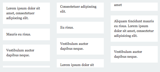
Columns do a great job of flowing and balancing content. Unfortunately, not all elements flow gracefully. Sometimes elements get stuck between columns.

Fortunately, you can tell the browser to keep specific elements together with break-inside.
li {
-webkit-column-break-inside: avoid;
          page-break-inside: avoid;
               break-inside: avoid;
}
At the moment, the property universally accepts the values auto and avoid.
Use avoid on an element within a multi-column layout to keep the property from breaking apart.
Take one extra look at the syntax for this property as there’s some variation among the browsers.
-webkit-column-break-inside: avoid; /* Chrome, Safari, Opera */
          page-break-inside: avoid; /* Firefox */
               break-inside: avoid; /* IE 10+ */
The property takes after the page break properties and shares the same values. For now, Firefox uses page-break-inside.
Additional resources
Browser support
Page break properties:
This browser support data is from Caniuse, which has more detail. A number indicates that browser supports the feature at that version and up.
Desktop
| Chrome | Firefox | IE | Edge | Safari |
|---|---|---|---|---|
| 126 | 127 | 11 | 123 | TP |
Mobile / Tablet
| Android Chrome | Android Firefox | Android | iOS Safari |
|---|---|---|---|
| 123 | 124 | 123 | 17.5 |
Multi-column layout support:
This browser support data is from Caniuse, which has more detail. A number indicates that browser supports the feature at that version and up.
Desktop
| Chrome | Firefox | IE | Edge | Safari |
|---|---|---|---|---|
| 126 | 127 | 10 | 12 | 10 |
Mobile / Tablet
| Android Chrome | Android Firefox | Android | iOS Safari |
|---|---|---|---|
| 123 | 124 | 123 | 10.0-10.2 |

Dear Chris,
i’ve discovered that using
-webkit-column-break-inside: avoidbehaves inconsistent when the number of elements inside the container varies. I’ve adjusted your pen to illustrate it.Here’s the bug req. on chromium: https://bugs.chromium.org/p/chromium/issues/detail?id=628927
The link to page break is broken in the following phrase…
“The property takes after the page break properties and shares the same values.”
First line of my second column is indented/centered/mis-aligned but only in Firefox. Please look at http://www.ams-net.org/~testing/columns.php
This works when the container (on which we apply the column layout) contains more than one element.
If there is only one element, Firefox will break it to make it fit on all the columns (which also has another Firefox bug: links and hover in the first cut blocks do not work). To avoid this behaviour, I apply
display: inline-blockon the block only if it is the only one of the list, with this:This might produce other glitches but it is sufficient for my usage (at least as long as Firefox keeps breaking the single element).
I suspect that Firefox has this behaviour each time there are X elements in a container where I apply N columns, and where X<N).
Thank you so much. Saved me
Just Saved me …Thanks a lot
Thank you. I agree that CSS columns has issue when items are less than the column-rows we specify. it breaks on FF and IE.
Thanks for the article! It’s perfect… almost. In the codepen example, I see that the columns are all not flush with the top edge of their container. As I resize the window, one or two sometimes has padding at the top, and sometimes it doesn’t.
Any idea on how to address this inconsistency? I’ve been researching my buns off here, but am turning up no solutions. :(
Thanks!
I think I have found the missing piece of the puzzle: When I got rid of the margin-bottom on the , the top edge alignment problem went away.
Very helpful, thank you!
Very informative. I have a problem where I have paged media with two columns on consecutive pages, but instead of wrapping the text from pg 1 left col to pg 1 right col and then going on to pg 2 left col, it goes from pg 1 left col to pg 2 left col and then back to pg 1 right col. Any idea how I can fix this? When using print preview in Chrome it displays correctly, but I need to use Acrobat to convert HTML to PDF and in that case it leads to this problem…
Are you setting the columns with a column count of 2 or with column widths of 50%? Perhaps a column width of 50% would cause the Acrobat converter to treat the second page as new columns instead of continuation of the first page’s columns.
Alternately, if you’re not locked into Acrobat, perhaps you could use Chrome’s built-in export feature? e.g.
chrome –headless –print-to-pdf=”d:\{{path and file name}}.pdf” https://google.com
Hi, I’ve come across an issue with columns in IE11 when I use “break-inside: avoid”, I get this random space at the bottom of the parent div that I can only get rid of if I don’t use “break-inside: avoid”, but then I get the children div breaking and overflowing onto the next column.
I’ve replicated a simplified example on Codepen: codepen.io/hcone5006/debug/bxmmpM/ in IE11.
Has anyone come up with this issue?
Finally resolved it by adding display: inline-block; to the element we’re avoiding break-inside. Hope that helps.
This didn’t prevent from splitting child element.
Only
display: inline-blockworkeddisplay: inline-blockhelped me with my firefox breaking issues. thank you2020
To all that is still looking for a fix for:
CSS Columns breaking in Firefox/IE11.
Breaking when column-item is less no. of columns
try also:
overflow: hidden;
on the items inside the column.
hope it helps. it worked for me!
Hi I am here to get a solution or advice of the Safari browser issue that cause duplicating the elements above to css column span element
http://www.graphicguru.in/csscolumns.html
I reported to webkit team no response yet, seeking a help here
https://bugs.webkit.org/show_bug.cgi?id=214219