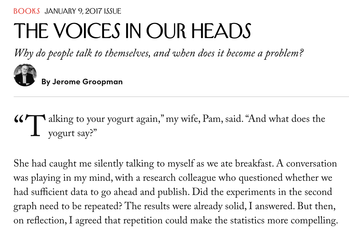
initial-letter is a CSS property that selects the first letter of the element where it is applied and specifies the number of lines the letter occupies.
You may have seen something like this on news sites, where the first letter of a leading paragraph is larger than the rest of the content.

The trick with styling the first letter of content used to take a little hack where you wrap the letter in a <div> and apply a class to style it:
/* Style that first letter! */
.first-letter {
  font-size: 35px;
  line-height: 70px;
}
<p><span class="first-letter">O</span>nce upon a time in a faraway land...<p>That works, but it’s more HTML markup than we want and breaks up our content. Plus, it’s pain to have to apply that class manually any time you want to use it.
That where initial-letter comes in:
/* Style that first letter! */
.subhead {
  initial-letter: 2;
}
<p class="subhead">Once upon a time in a faraway land...<p>That’s cleaner! Another approach is to apply it to the ::first-letter psuedo-selector instead:
/* Style that first letter! */
.subhead::first-letter {
  initial-letter: 2;
}
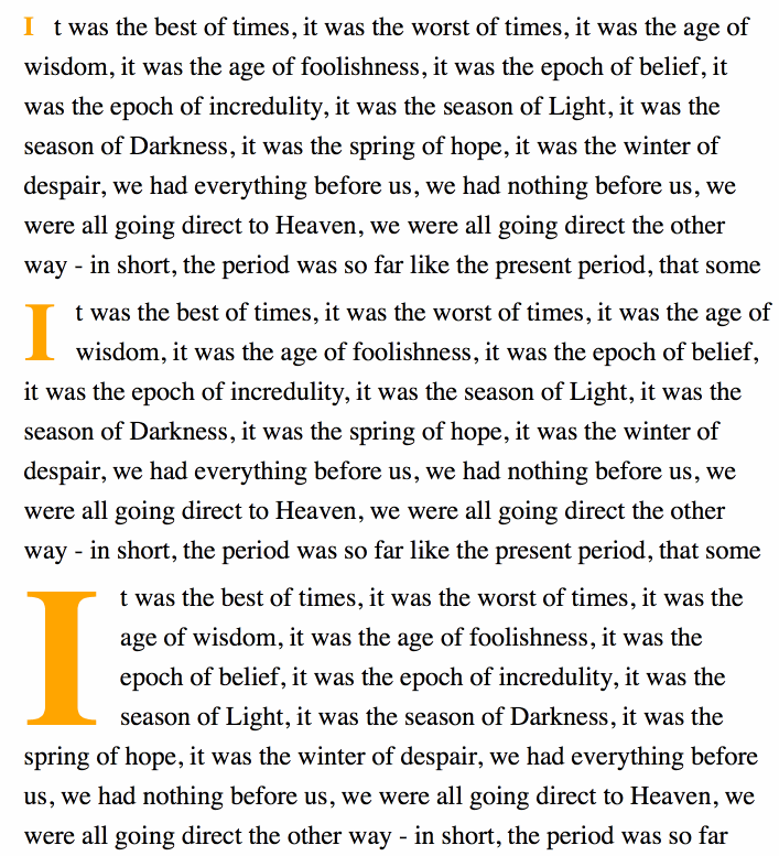
Did you see that? The initial-letter property automatically calculates both the font size and the number of lines needed to create our stylized drop cap! Want it to take up exactly 2, 3, 4 or more lines? Tell the property and it will do the heavy lifting.

Syntax and Values
initial-letter: normal | [<number> <integer>];initial-letter accepts the following values:
normal: Does not apply a scaling effect on the first letter. This can be useful for resetting the value where one might be inherited from the cascade.<number>: How many lines the letter should occupy where negative values are not allowed.<integer>: How many lines the letter should sink where negative values are not allowed. This is handy should you need to position the letter lower to accommodate tricky spacing issues but, if not specified, it takes the value of<number>
Examples

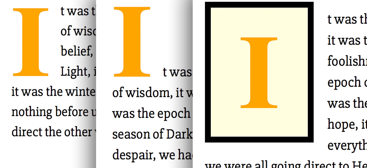
Styling the initial letter can be used to achieve some fancy typographical design methods. Please note that the following examples are only currently supported by Safari.
Drop Caps are probably the most familiar use case:
See the Pen initial-letter: Drop Cap by Geoff Graham (@geoffgraham) on CodePen.
Raised Caps are another example:
See the Pen initial-letter: Raised Cap by Geoff Graham (@geoffgraham) on CodePen.
Block Caps harken back to old fairy tales:
See the Pen initial-letter: Block Cap by Geoff Graham (@geoffgraham) on CodePen.
Browser Support
This browser support data is from Caniuse, which has more detail. A number indicates that browser supports the feature at that version and up.
Desktop
| Chrome | Firefox | IE | Edge | Safari |
|---|---|---|---|---|
| 126 | No | No | 123 | TP* |
Mobile / Tablet
| Android Chrome | Android Firefox | Android | iOS Safari |
|---|---|---|---|
| 123 | No | 123 | 17.5* |
Related
More Information
- CSS Inline Layout Module Level 3: The offifical specificiations
- Jen Simmons Labs: Demos and examples of the use cases
- Firefox Ticket: Open ticket for supporting the feature
- Internet Explorer Ticket: Open ticket for supporting the feature

This is a nice writeup and would have been a very useful function. Sdaly, we’re 2 years on and there is still practically no browser support.