The CSS border-image-width property is used to determine the width of the border’s image file, as provided by the CSS border-image-source property.
.container {
  border-style: ridge;
  border-width: 3rem;
  border-image-source: url('path/to/image.jpg');
  border-image-slice: 70;
  border-image-width: 40%;
  border-image-repeat: repeat;
}The border-image-width property is defined in the CSS Backgrounds and Borders Module Level 3 specification. It’s function is described as “drawing areas” which is an apt description of how the property draws an area along the outer edge of the element to reserve space for the border image.
Syntax
border-image-width: [<length-percentage [0,∞]> | <number [0,∞]> | auto ]{1,4}- Initial value: 1
- Applies to: all elements (including the
::first-letterpseudo-element), except internal table elements whenborder-collapseis set tocollapse. - Inherited: no
- Percentages: Relative to the width/height of the border image area
- Computed value: four values, each either a number, the keyword
auto, or a computed<length-percentage>value - Animation type: by computed value
border-image-width accepts between one and four values, much like the margin and padding shorthand properties:
- One value: Sets all four sides at the same offset distance
- Two values: The first value sets the offset for the top and bottom sides; the second value sets the offset for the left and right sides
- Three values: The first value sets the offset for the top side; the second value sets the offset for the right and left sides; the third sets the offset for the bottom side
- Four values: Sets the offset for each side in clockwise order, starting from the top side (top, right, bottom, and left, in that order)
Values
/* Keyword value */
border-image-width: auto;

/* Single value */
/* Sets all four sides */
border-image-width: 20%;
border-image-width: 2rem;
border-image-width: auto;

/* Two values */
/* top and bottom | left and right */
border-image-width: 4rem 10%;
border-image-width: auto 3rem;
border-image-width: 2 2rem;

/* Three values */
/* top | left and right | bottom */
border-image-width: 10% 40% 4;
border-image-width: 5 auto 10;
border-image-width: 30% 60% auto;

/* Four values */
/* top | right | bottom | left */
border-image-width: 20 3rem 40% auto;
border-image-width: 2 10rem 10% 40%;
border-image-width: 40 auto 20% auto;

/* Global values */
border-image-width: inherit;
border-image-width: initial;
border-image-width: revert;
border-image-width: revert-layer;
border-image-width: unset;
<length-percentage [0,∞]>
The <length-percentage> value specifies either a length or a percentage value that can be set on the CSS border-image-width property to specify the width and height of the image on the border.
The length value specifies the width and height dimensions of the image in CSS units:
.container{
  /* top and bottom | left and right */
  border-image-width: 4rem 4.5rem;
}
The example above specifies a 4rem unit length for the top and bottom offsets of the border, and a 4.5rem unit length for the left and right offsets of the border.
The percentage value expresses the border image’s width and height dimensions as a percentage:
.container {
  border-image-width: 20%;
}
It works just like the border-image-slice property’s percentage value where the percentages are relative to the size of the image. For example, the dimensions for the GIF used in the demo below are 498px×280px. When we set the border-image-width value to 20%, the computed width which is 99.6px (498px * 20%) along the top and bottom, and of the height 56px (280px * 20%) along the right and left sides of the border.
number [0,∞]
When a unitless, non-negative integer is used as the border-image-width value, it represents a multiple of the element’s border-width value. Consider the following:
.container {
  border-image-width: 2;
  border-width: 2rem;
}
Here, the border-image-width value (2) is multiplied by the border-width value (2rem) to calculate the used width (4rem) of the border image.
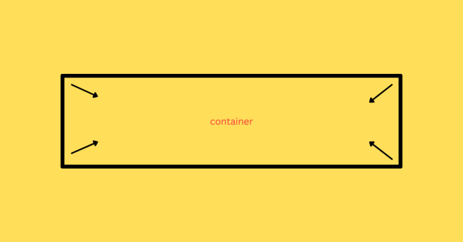
Note, too, that border-image-width draws its border from the element’s border box, according to the CSS Box Model. And when it draws the area, it starts from the border box and works inward.

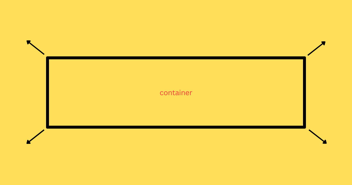
border-image-width is sized from the outside edge of the element toward the inside of the element.It is entirely different from how border-width works, which enlarges the container’s border box, increasing the element’s overall size dimensions.

border-width is sized from the outside edge of the element beyond the element’s border-box.In other words, border-image-width enlarges the image width without affecting the element’s overall size.
auto
Using the auto keyword is based by either the natural (not specified) size of the image provided by border-image-source or the element’s border-width value.
How does it choose which to use? If the image has a natural (or “intrinsic”) size, that’s the value. For example, if the image is 200px square, then 200px is the applied value. If there is no natural size, say an SVG without width or height attributes, then the border-width value is used instead.
And what if there is no border-width on the element? The initial style of border-width is none which results in a width of zero.
By “natural size” we mean the image’s full width and height dimensions. Like, if we drop an <img> on a page and it is 500px square, that’s the natural size. That’s different than size of the image in its context. For example, if we set that same image with <img width="200"> the natural size is still 500px square even though renders at 200px on the screen.
Overlapping borders
Let’s say we have a border image with a natural size of 500px square:
.element {
  border-image-source: url("/image-500px.webp");
}
Now let’s say we set border-image-width to a value that exceeds the image dimensions:
.element {
  border-image-source: url("/image-500px.webp");
  border-image-width: 2; /* 400px = 200px * 2 */
  border-width: 200px;
}
The borders would overlap in this sort of situation since the offsets combine to 800px in the width and height dimensions. However, the property is “smart” in that it reduces the applied border-image-width value of each side proportionally until the borders no longer overlap. In this case, the value needs to be reduced by 100px per offset to fit the image’s natural dimensions.
The spec provides the formula the browser uses to figure that out:
f = min(Lwidth/(Wleft + Wright), Lheight/(Wtop + Wbottom))Where:
Lwidth = width of the border image area (`border-width`)
Lheight = height of the border image area
Wleft = Left offset of the border image width
Wright = Right offset of the border image width
Wtop = Top offset of the border image width
Wbottom = Bottom offset of the border image width
After we’ve calculated f, we check if f < 1, and if it is, we multiply the offset values (Wleft, Wright, Wtop, Wbottom ) by f to reduce it.
Substituting our values from the example above into our equation, we have:
f = min(200px/(400px + 400px), 500px/(400px + 400px)) = 0.25Since f is less than 1, we multiply all the offsets by 0.25 resulting in the new offset value, 100px.
Demo
Change the values below for the border-image-width and border-width to see how each input affects the image size.
Browser support
More information
- CSS Backgrounds and Borders Module Level 3 (W3C specification)
- Understanding border-image (CSS-Tricks)
- How To Add Border Images and Gradient Borders with Pure CSS (DigitalOcean)
