The ::placeholder pseudo element (or a pseudo class, in some cases, depending on the browser implementation) allows you to style the placeholder text of a form element. As in, the text set with the placeholder attribute:
<input type="email" placeholder="[email protected]">You can style that text across most browsers with this smattering of vendor-prefixed selectors:
::-webkit-input-placeholder { /* Chrome/Opera/Safari */
  color: pink;
}
::-moz-placeholder { /* Firefox 19+ */
  color: pink;
}
:-ms-input-placeholder { /* IE 10+ */
  color: pink;
}
:-moz-placeholder { /* Firefox 18- */
  color: pink;
}
Important warning: this syntax is non-standard, thus all the naming craziness. It doesn’t appear in the spec at all. :placeholder-shown is standard, and even spec authors seem to think ::placeholder will be the standardized version.
Like any psuedo, you can scope it to specific elements as needed, like:
input[type="email"].big-dog::-webkit-input-placeholder {
  color: orange;
}
Demo
The difference between :placeholder-shown and ::placeholder
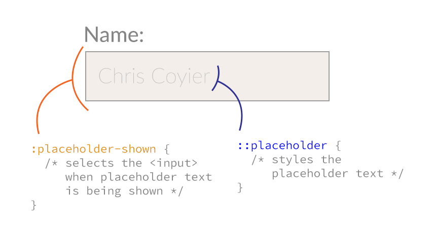
:placeholder-shown is for selecting the input itself when it’s placeholder text is being shown. As opposed to ::placeholder which styles the placeholder text.
Here’s a diagram:

I found this highly confusing as:
- the specs only have
:placeholder-shownand not::placeholder :placeholder-showncan still affect the styling of the placeholder text, since it’s a parent element (e.g. font-size).
Note that :placeholder-shown is a pseudo class (it’s an element in a particular state) and ::placeholder is a pseudo element (a visible thing that isn’t really in the DOM). Distinguishable by single-versus-double colons.
Tab Atkins cleared it up for me via email:
:placeholder-shown, being a pseudo-class, has to select an existing element – it selects the input whenever you’re in the placeholder-showing state. The ::placeholder pseudo-element wraps the actual placeholder text.
Element or class?
This functionality is not standardized. That means that every browser has a different idea on how it should work.
Firefox originally implemented this as a pseudo class, but changed it for a bunch of reasons. To make a long story short, you can’t do as much with a pseudo class.
For instance, if you want to change the color of the text when the input is focused. You would use a selector like input:focus::placeholder, which you wouldn’t be able to do with a pseudo class (they don’t stack the same way).
IE10 supports this as a pseudo class, rather than an element. Everyone else has implemented a pseudo element.
Firefox placeholder color
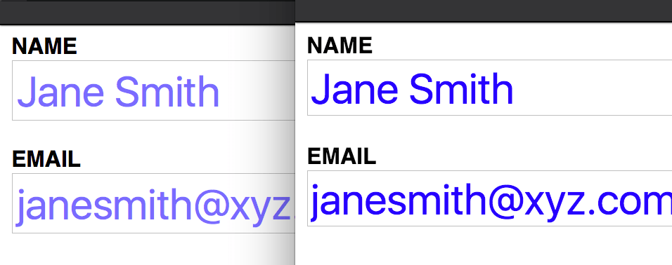
You might notice how in Firefox the color of the placeholder looks faded when compared to other browsers. In the image below, Firefox 43 is shown on the left whilst Chrome 47 is shown on the right:

This is because, by default, all placeholders in Firefox have an opacity value applied to them, so in order to fix this we need to reset that value:
::-moz-placeholder {
  opacity: 1;
}
You can see more by testing this demo out in Firefox.
Supported Styles
The pseudo element supports styling of these properties:
fontpropertiescolorbackgroundpropertiesword-spacingletter-spacingtext-decorationvertical-aligntext-transformline-heighttext-indentopacity
The pseudo class supports most (if not all) of these properties as well, but isn’t as flexible for the reasons outlined above.
Browser support
This browser support data is from Caniuse, which has more detail. A number indicates that browser supports the feature at that version and up.
Desktop
| Chrome | Firefox | IE | Edge | Safari |
|---|---|---|---|---|
| 57 | 19* | No | 79 | 10.1 |
Mobile / Tablet
| Android Chrome | Android Firefox | Android | iOS Safari |
|---|---|---|---|
| 123 | 124 | 123 | 10.3 |
Other resources
- MDN Docs
- “The CSS3 Placeholder Pseudo-element” by Guil Hernandez
- “Styling HTML placeholder attribute” by Mounir Lamouri
- “Styling Placeholders” by Tab Atkins

input{text-align:left}
::-moz-placeholder, :-moz-placeholder {text-align:right !important;}
But “text-align:right” does not work!
Text-align doesn’t supported at this moment.
You can solve this by:
//this would be better in my opinion
::placeholder:read{}
:placeholder:write{}
Some browsers (Firefox tested) use opacity for placeholders. So, if you want to control the color with the
colorproperty alone, also remember to setopacity: 1.Hi Hakan, I was just struggling with Firefox and your comment solved my problem, thank you very much!
Rob
Oh my God, thank you Håkan! I was just stumped by that as well.
Thanks a lot!
After 3 year you saved my life ahahah thx man
also it’s important to use each declaration as a separated declaration, like in this article, and not like this:
thanks ;)
Sorry, I wanna know why is important to use each declaration separated and not all together?
It won’t work if you write it all together. I tried it
Thanks Ruslan!
Thanks! I’ve been struggling with this for days. You just cured my headache.
Try this example
My question is how to center align the placeholder text in text box for safari.. I tried in mobile as well as desktop browser also.. It s left aligned only
Pls let me know if any one knws
how can I align input email form to left and placeholder to right in this code:
Try this:
deffine of placeholder
@Mohit Pilania
text-alignis not supported by all browsers.Instead:
Anyone experienced an issue in older versions of Opera that the placeholder aligns to the right???
Is there a way of fixing this issue if ‘text-align’ isn’t supported?
text-indent doesn’t supported in Chrome mobile
see here http://stackoverflow.com/questions/21594026/placeholder-always-align-left-in-safari
placeholder + text-indent doesn’t work in android browser (4.2), who have a solution?
placeholder text issue in IE browser, how can i solve that?
am already use this below code:
:-ms-input-placeholder{color:#999;}
but is’t work in my IE browser
@font-face is not work in IE9 browser, how can i solve that?
am already using this given below code to my project:
@font-face{font-family:”OpenSans-Regular”; src:url(‘../new_font/OpenSans-Regular.ttf’) format(‘truetype’); src:url(‘../new_font/OpenSans-Regular.ttf?#iefix’) format(‘truetype’);}
How to centre align of input-box watermark in safari browser 5.1.7?
This doesn’t appear to work within Chrome on iOS?
Use CSS direction property to move placeholder content to the right.
Thanks a lot.
the “testing this demo out in Firefox.” link at the end is broken
6 months later and it’s still broken..
Here’s the correct one: http://codepen.io/team/css-tricks/pen/36c9b95c815e9c96e31d1d28ea6f8224?editors=110
Great post, keep the good work. Thanks!
Is there a specific place I need to add this within in my javascript?
Hi Chris,
Looks like typo — I had to put the dash:
input[type="email"].big-dog::-webkit-input-placeholder {color: orange;
}
Also the Codepen link does not appear to have a working example.
For people asking about old IE, you have to use a script instead of this CSS.
Looks like Desktop Chrome, Desktop Firefox, iOS Safari, and IE10+ now support simply
::placeholderand don’t require the prefixes anymore. :)Please tell me how to change placeholder color of
Hi, this is very helpful, but I am still running into an issue with the placeholder text looking “washed out” on Safari. Here’s what I have:
#ysw_search_box_id::-moz-placeholder, #ysw_search_box_id:-ms-input-placeholder, #ysw_search_box_id:-moz-placeholder {
color: #191919; opacity: 1; font-weight: bold; font-family: arial; font-size: 14px;
}
Do I just have the wrong syntax? Sorry, I am not a techie – just starting to learn!!
Thanks!
When the placeholder’s font-size is different to input font-size, the placeholder is missaligned vertically in Chrome (in Firefox works fine) -> https://jsfiddle.net/pmyd087f/
Use something like this. The Input itself has 25px font, the placeholder also but is scaled 0.6 and will be 15px. Works in Safari Chrome and Edge Why is this not working in Firefox?
&::placeholder {font-size: 25px;
letter-spacing: normal;
transform: scale(0.6);
}
can anyone tell me how to align placeholder in left top
This page needs an update, because for Edge you will need
::-ms-input-placeholder(with a double colon)Thank you, thats what I looking for
So useful! Thank you!
thank you my friend…
Otherwise the declaration will have no effect. Check this example
For me, i’ve had to put “input” in front of all, otherwise it doesn’t work.
How to align placeholder in HTML not text.
Good Post. Include style for Microsoft Edge browser also.
Nice. But would it be okay to remove the element qualifier from these declarations? If not they’ll only be applied to input tags and not, for example, textarea tags.
i love this selector, make my input style more cool
Wowwwww thank you, this is exactly what I needed! Thank you so much for explaining the difference between ::placeholder and :placeholder-shown as well!