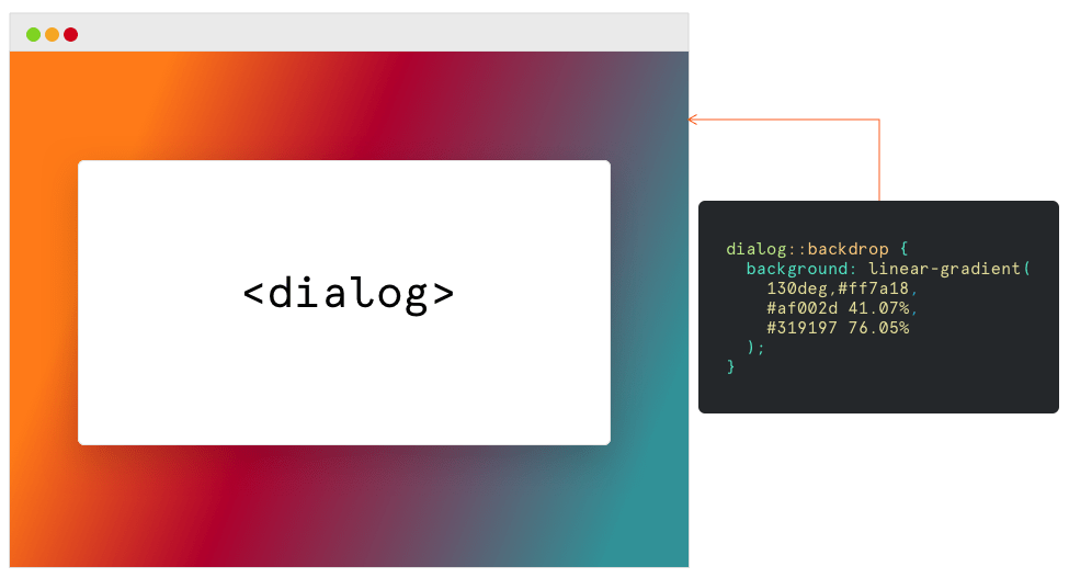
The ::backdrop CSS pseudo-element creates a backdrop that covers the entire viewport and is rendered immediately below a <dialog> or any element that enters fullscreen mode using the Fullscreen API.
dialog::backdrop {
  background-color: darkorange;
}

Bottom line: we get something to hook into for styling the full background behind elements when the browser is in fullscreen mode. And when we say “fullscreen mode” what we’re talking about is the browser taking up the entire screen of a monitor — not to be confused with the browser viewport. Often, fullscreen mode is triggered by an option in the operating system to expand a window.

::backdrop does not inherit from any element and is not inherited from. So, there’s no cascade happening where you might run into a conflict between the backdrops of two elements.
Styling the backdrop of a dialog
Consider the following <dialog> element in HTML:
<dialog>
  <h2>I'm a dialog window</h2>
  <button onclick="closeDialog()">Close</button>
</dialog>

<button onclick="openDialog()">Open dialog</button>
::backdrop can be used to style behind a <dialog> when the dialog is displayed with HTMLDialogElement.showModal(), which is currently experimental, but is what provides the ::backdrop.

var dialog = document.querySelector('dialog');
function openDialog() {
  dialog.showModal();
}
function closeDialog() {
  dialog.close();
}
Now, if we click on the button and open the dialog, the following CSS works:
dialog::backdrop {
  background-color: darkorange;
  background-image: linear-gradient(
    130deg,#ff7a18,
    #af002d 41.07%,
    #319197 76.05%
  );
}
Open the <dialog> element in the following demo and see the style that we applied to dialog’s backdrop:
Styling the backdrop of an element in fullscreen mode
When media, like images and videos, enter fullscreen mode, it’s possible that they won’t cover the entire viewport. Like, there might be empty space around it. Currently, Chrome’s default style for the backdrop looks like this:
dialog::backdrop {
  position: fixed;
  top: 0px;
  right: 0px;
  bottom: 0px;
  left: 0px;
  background: rgba(0, 0, 0, 0.1);
}
With ::backdrop, we can style it ourselves or simply tweak what’s already there. For example, how about a slightly darker background?
video::backdrop {
  background: hsla(0, 0%, 0%, .5);
}
The backdrop in the following demo is visible because the width of the video is narrower than the width of the entire viewport.
Transforms, animations and hover states
Since there are no restrictions on what properties we can declare on this pseudo-element, it’s possible to add animations and transforms to a backdrop — or even change the style on states, like hover:
.element::backdrop {
  animation: move 5s infinite linear paused both;
  background: conic-gradient(red, orange, yellow, green, blue);
}

.element:hover::backdrop {
  animation-play-state: running;
}

@keyframes move {
  50% {
    transform: scale(0.9);
  }
}
Browser support
| IE | Edge | Firefox | Chrome | Safari | Opera |
|---|---|---|---|---|---|
| 11 | All | 47 | 32 | No | 19 |
| iOS Safari | Opera Mobile | Android Browser | Chrome for Android | Firefox for Android |
|---|---|---|---|---|
| No | 64 | 92 | All | All |
