The grid-auto-flow CSS property is part of the CSS Grid Layout specification that allows us to control the flow of grid items that are automatically placed when they are not explicitly positioned with any grid-placement properties.
.grid-container {
  display: grid;
  grid-template-columns: repeat(8, 50px);
  grid-auto-flow: dense;
}
That example creates a grid container that can hold eight items in each row and fills any remaining available space with smaller items that come later and can fit the space.
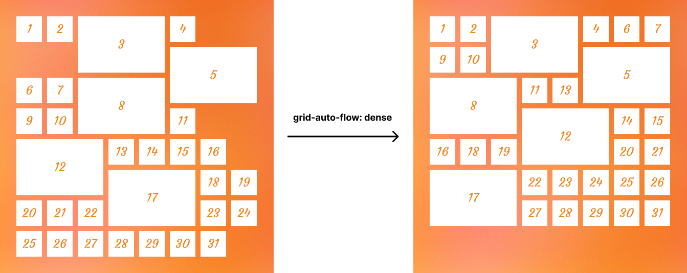
grid-auto-flow: dense in a grid layout.Syntax
grid-auto-flow: [ row | column ] || dense- Initial value:
row - Applies to: grid containers
- Inherited: no
- Computed value: as specified
- Animation type: discrete
Values
/* Keyword values */
grid-auto-flow: column;
grid-auto-flow: row;
grid-auto-flow: dense;
grid-auto-flow: column dense;
grid-auto-flow: row dense; /* same as `dense` */


/* Global values */
grid-auto-flow: inherit;
grid-auto-flow: initial; /* same as `row` */
grid-auto-flow: revert;
grid-auto-flow: revert-layer;
grid-auto-flow: unset;
row
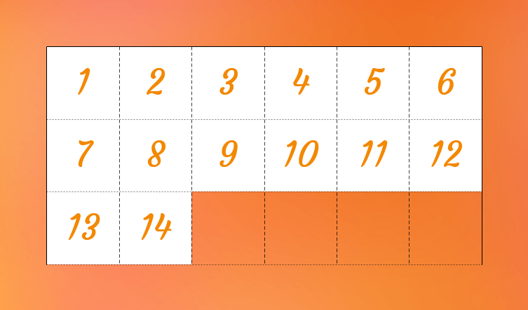
This is the default value. Once specified, items will be laid out in a horizontal direction. Grid’s auto-placement algorithm will place grid items by filling each row and will only create new rows if needed.
.grid-container {
  display: grid;
  grid-template-columns: repeat(auto-fill, 50px);
  grid-auto-rows: 50px;
}
This example shows that the grid items are placed next to each other in a row and once there is no room in the current row, grid adds new rows automatically in order to place the rest of the grid items.
column
Grid items will be laid out vertically by column. The auto-placement algorithm will place grid items by filling each column and create additional columns if needed.
.grid-container {
  display: grid;
  grid-template-columns: repeat(auto-fill, 50px);
  grid-template-rows: 50px 50px 50px;
  grid-auto-flow: column;
}
As you see in the following image, in this example, grid places the items in columns and once there is no cell left, it automatically moves on to the new column until there are no more grid items.
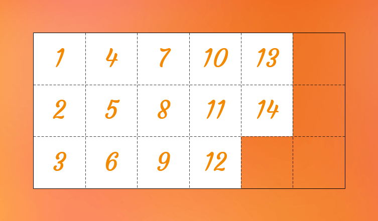
grid-auto-flow property to column makes the auto-placement algorithm to places grid items by filling each column and create new columns if necessary.In the above example, there were three rows explicitly defined by grid-template-rows. Now let’s see another example with no rows specified and grid-auto-flow being set to column:
.grid-container {
  display: grid;
  grid-template-columns: repeat(5, 50px);
  grid-auto-flow: column;
}
Here we only defined five columns but since we set auto-placement to column, it generates additional columns in order to place the rest of the grid items, which may cause an overflow.

grid-auto-flow: column puts items next to each other. No additional rows are specified, which causes the grid to overflow its container.Note that those additional columns are called implicit columns and we can control their size using the grid-auto-columns property.
dense
If specified, the auto-placement algorithm attempts to fill available space in the grid with smaller items, even if they are out of order in the markup.
To understand better the dense keyword value, let’s establish an 8×8 grid of 50px squares as an example:
.grid-container {
  display: grid;
  grid-template-columns: repeat(8, 50px);
  grid-template-rows: repeat(8, 50px);
}
Then we expand the size of some of them:
.grid-item:is(:nth-child(3), :nth-child(5), :nth-child(8), :nth-child(12), :nth-child(17) {
  grid-column: span 3;
  grid-row: span 2;
}
You can see the result in the following image:
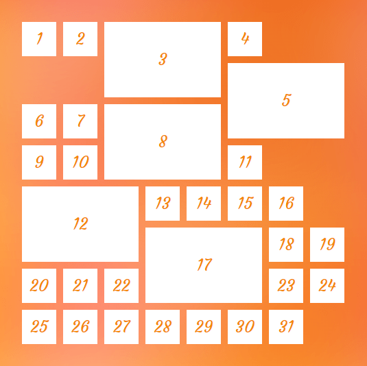
As you can see, by default, grid lays out items in the same order as they are in the HTML order. And when it comes to a space where it can’t fit an item, it skips that space, leaving “holes” in our layout.
The dense keyword changes this behavior by allowing the grid to ignore the HTML in a way that, when it finds an item that fits a hole, it will take the item — regardless of whether it’s next in the HTML or not — and places it into that hole.
.grid-container {
  display: grid;
  grid-template-columns: repeat(8, 50px);
  grid-template-rows: repeat(8, 50px);
  grid-auto-flow: dense;
}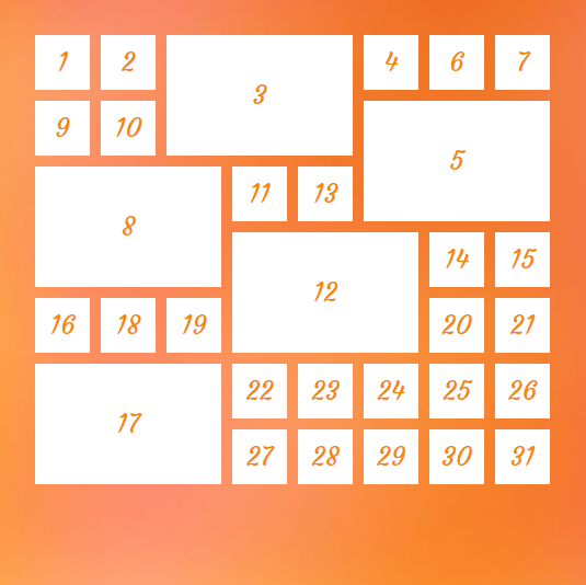
dense keyword makes auto-placement algorithm to reorder items in order to back-fill holes in the layout.Take a look at the sixth grid item, now it moved in order to fill the first hole that it can fit in.
So by default, grid progresses forward and never looks back to check if it can fit an item in previous empty spaces. But when we declare dense, the algorithm attempts to fill as many holes as it can, regardless of the source order.
row dense
Since row is the default value, using row dense is the same as using dense and it has the same effect.
column dense
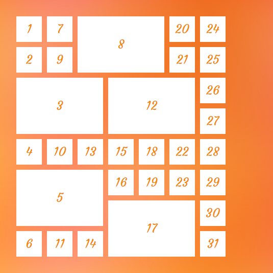
Grid items will be laid out by column while filling holes.
If we change the value of grid-auto-flow property to column dense in the previous example, we will have the following result:
.grid-container {
  display: grid;
  grid-template-columns: repeat(8, 50px);
  grid-template-rows: repeat(8, 50px);
  grid-auto-flow: column dense;
}
Accessibility concern
One thing to note when using the grid-auto-flow property is the issue caused by dense algorithm.
The dense keyword only changes the visual order of the grid items and that order might not be the same as the original document order which may cause a very bad experience for someone tabbing through the document on a keyboard or listening to a screen reader that’s reads content in the same order as the HTML.
So, avoid using the dense keyword values when the HTML order of the elements matters. For example, it can be good for a random image gallery but perhaps not so much for your form inputs.
However, at the time of this writing, there is a proposal to tackle this issue that will hopefully resolve this concern in the future.
Demo
Creating a gallery with CSS Grid has become very enjoyable and you can add grid-auto-flow to make it more awesome:
.gallery {
  display: grid;
  grid-template-columns: repeat(8, 8vw);
  grid-template-rows: repeat(8, 8vw);
  grid-auto-flow: dense;
  gap: 1rem;
}

.item:is(:nth-child(2), :nth-child(4), :nth-child(6)) {
  grid-column: span 2;
  grid-row: span 2;
}
You can change the value of the grid-auto-flow property to see its effect on the gallery:
Browser support
Specification
CSS Grid Layout Module Level 2
More information
A Complete Guide to CSS Grid
The Auto-Flowing Powers of Grid’s Dense Keyword
grid-auto-flow : CSS Grid :: flex-direction : Flexbox
Flexbox-like “just put elements in a row” with CSS grid
Using the Grid Shepherd Technique to Order Data with CSS
Grid, content re-ordering and accessibility
Related
display
.element { display: inline-block; }
grid-auto-columns
.element { grid-auto-columns: minmax(100px, 200px); }
grid-auto-rows
.element { grid-auto-rows: minmax(1fr, 500px) 3fr; }
grid-template-areas
.element { grid-template-areas: "header header" "sidebar main"; }
grid-template-columns
.element { grid-template-columns: 300px 1fr; }
grid-template-rows
.element { grid-template-rows: minmax(auto, 1fr) 3fr; }
