The mask-mode CSS property indicates whether the CSS mask layer image is treated as an alpha mask or a luminance mask.
.element {
  mask-image: url(sun.svg);
  mask-mode: alpha;
}
Syntax
mask-mode: alpha | luminance | match-sourceThe property accepts one keyword value, or a comma-separated list of two or all three of the alpha, luminance and mask-source values.
- Initial value:
match-source - Applies to: all elements. In SVG, it applies to container elements excluding the element, all graphics elements.
- Inherited: no
- Computed value: as specified
- Animation type: discrete
Values
/* Keyword values */
mask-mode: alpha;
mask-mode: luminance;
mask-mode: match-source;

/* Global values */
mask-mode: inherit;
mask-mode: initial;
mask-mode: unset;alpha: specifies that the alpha values (alpha channel) of the mask layer image should be used as the mask values.luminance: specifies that the luminance values of the mask image should be used as the mask values.match-source: the default value, which sets the mask mode to alpha if the mask reference of themask-imageproperty is a CSS<image>element like an image URL or a gradient. However, if the mask reference of themask-imageproperty is an SVG<mask>element, the value specified by the referenced<mask>element’s mask-type property must be used.initial: applies the property’s default setting, which ismatch-source.inherit: adopts the mask-mode value of the parent.unset: removes the current mask-mode from the element.
Using multiple values
This property can take a comma-separated list of values for mask modes and each value is applied to a corresponding mask layer image specified in the mask-image property.
In the following example, the first value specifies the mask mode corresponding to the first image, the second value for the second image, and so on.
.element {
  mask-image: url(image1.png), url(image2.png), url(image3.png);
  mask-mode: luminance, alpha, match-source;
}
Alpha and luminance masks
Masking in CSS comes with two methods that have some differences in calculating the mask values.
Alpha masks
Images are made of pixels, each pixel has some data containing color values and maybe alpha values with transparency information. An image with an alpha channel can be an alpha mask, like PNG images with black and transparent areas.
In a simple masking operation, we have an element and a mask image placed on top of it. The alpha value of each pixel in the mask image will be merged with its corresponding pixel in the element.
- If the alpha value is zero (i.e. transparent), it wins out and that part of the element is masked (i.e. hidden).
- An alpha value of one (i.e. fully opaque) allows that pixel of the element to be visible.
- A value between 0 and 1 (e.g. 0.5) allows the pixel to be visible but with a certain level of transparency.
So, in this method, the mask value at a given point is simply the value of the alpha channel at that point of the mask image and the color channels do not contribute to the mask value.
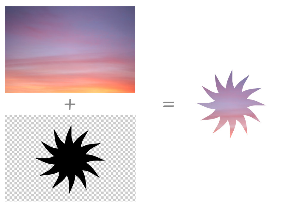
The example bellow is an alpha mask which only contains black (alpha value of 1) and transparent areas (alpha value of 0) and you can see the result that has some parts fully visible and others fully transparent:

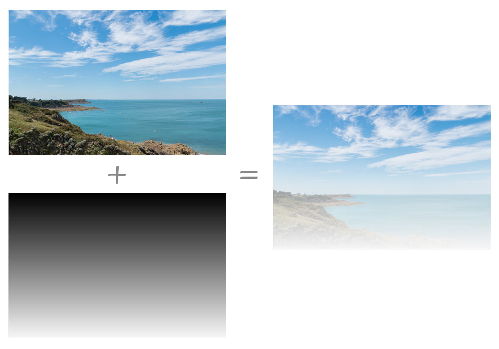
But in the following example, we are using a gradient that has different level of transparency. The result isn’t only visible or transparent, but there are some translucent areas:
img {
  mask-image: linear-gradient(black, transparent);
  mask-mode: alpha;
}
And here’s what the result looks like in the browser:

Luminance masks
In a luminance mask, colors and alpha values matter. When the alpha value is 0 (i.e. fully transparent), the element is hidden; when there alpha value is 1, the mask values vary depending on the color channel of that pixel. For example, when the color is white, the element is visible; in the case of black area, the element is hidden.
While calculating the mask values in an alpha mask is based only on the alpha values of the mask image, the mask values of a luminance mask are computed from the luminance and the alpha values. Browsers do this in the following steps:
- Compute a luminance value from the color channel values.
- Multiply the computed luminance value by the corresponding alpha value to produce the mask value.
/explanation For more information about these calculations you can check out the mask processing section in the CSS Masking Module 1 specification from the September 2019 Editor’s Draft.
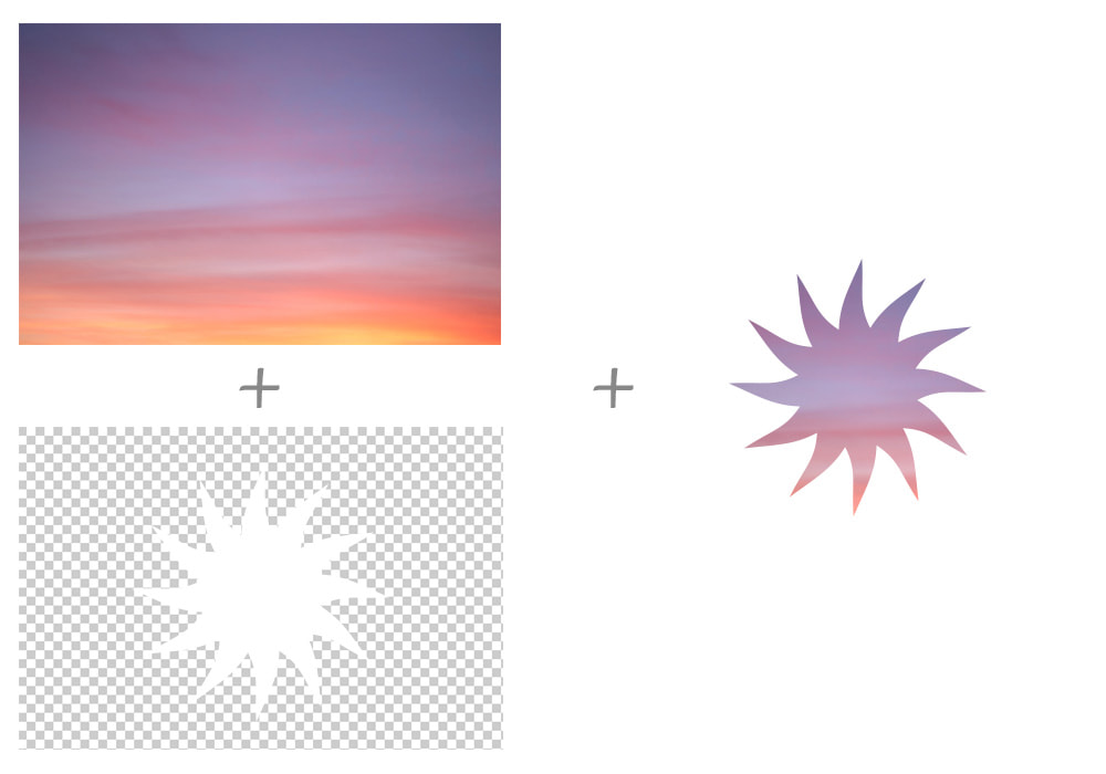
Bellow is a mask image with a white sun in the center and transparent areas around it. As you can see, the while areas are fully visible:

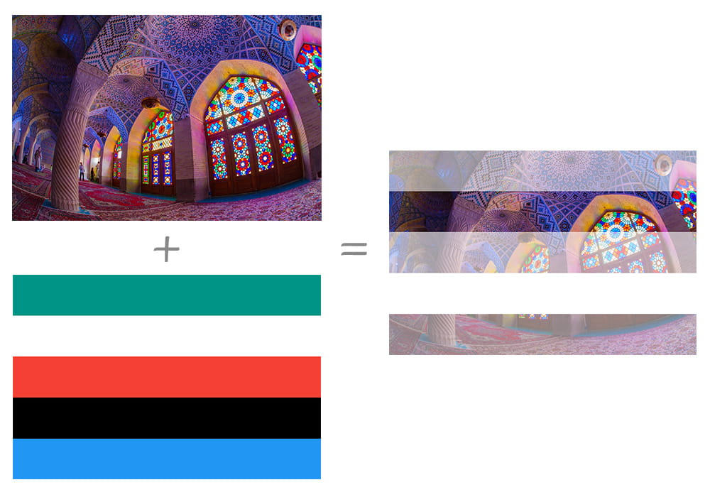
And in the next example, a colorful gradient is used as a mask image and you can see the effect of different colors on the mask values in the luminance mode:

Demo
In the following demo we are using a mask image with transparent and black areas:
Next demo presents a luminance mask with a gradient as a mask image:
Note
The mask-mode property overrides the definition of mask-type property.
Browser support
| IE | Edge | Firefox | Chrome | Safari | Opera |
|---|---|---|---|---|---|
| All | All | 53+ | All | All | All |
| Android Chrome | Android Firefox | Android Browser | iOS Safari | Opera Mobile |
|---|---|---|---|---|
| All | 83+ | All | All | All |
More information
Related properties
mask-clip
.element { mask-clip: padding-box; }
mask-image
.element { mask-image: url(star.svg); }
mask-origin
.element { mask-origin: content-box; }
mask-position
.element { mask-position: 20px center; }
mask-repeat
.element { mask-repeat: repeat-y; }
mask-size
.element { mask-size: 200px 100px; }
mask-type
.element { mask-type: alpha; }
