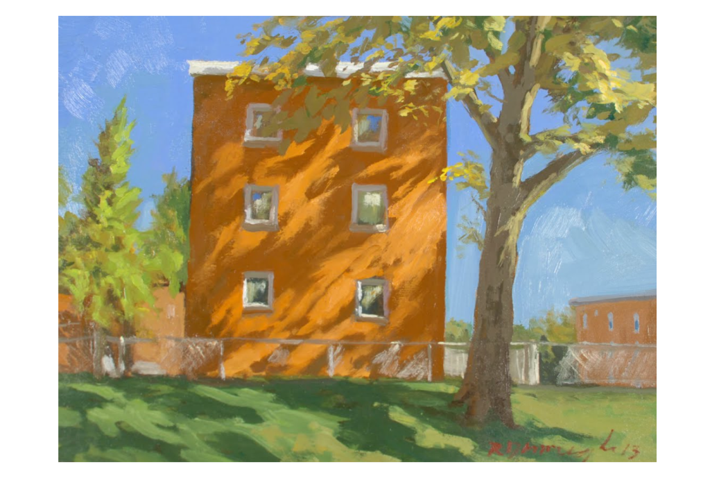
There’s a serene warmth to the early evening sunlight peaking through rustling leaves. Artists use dappled light to create a soft, hypnotic effect.

We can create the same sort of dappled light effect in web design, using it on photos and illustrations to add that magic touch to what might otherwise be drab walls of content to bring them back to life.
I’ll give you one easy, quick way to add this effect… with just CSS.
Before we get into the code, it’s important to know the composition of dappled light. It’s made up of large spots — circular or elliptical — of light that are intercepted by the shadows cast by the foliage. Basically the light that slips past leaves, branches and so forth. Sometimes the shadows create crisp edges, but are more often blurred since we’re talking about light that passes though many, less defined spaces that diffuse and distort the light as it casts shadows from a further distance than, say, your own stark shadow on a nearby wall from direct sunlight.
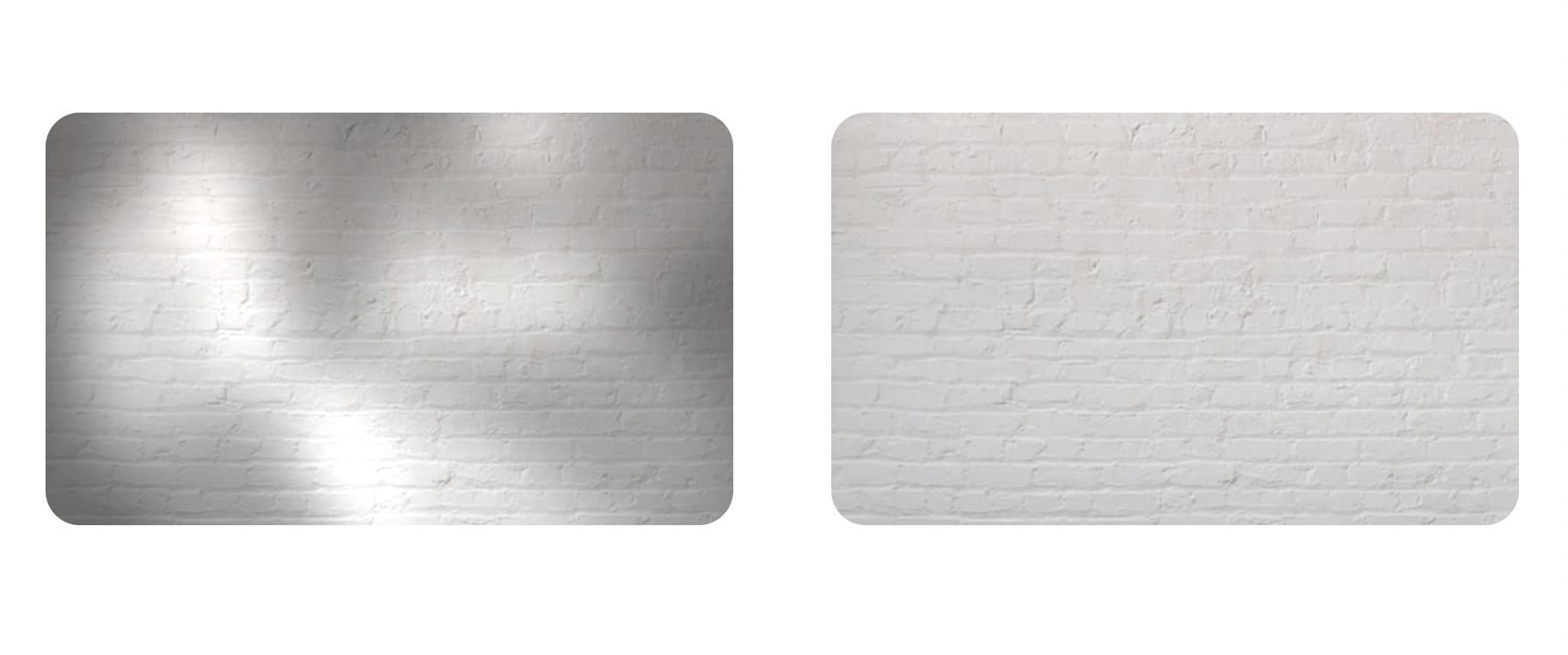
Here’s the difference in the appearance of a white wall with and without lit by dappled light:

I’m going to recreate the dappled light effect with both plain text and fun emojis, applying CSS shadows and blends to mimic nature. I’ll cover alternative methods too.
Setting the scene
We’ll use text — letters from the alphabet, special characters, emojis, etc. — to create the shapes of light. And by light, I mean pale, translucent colors. Again, we’re for a dappled light effect rather than something that’s sharp, crisp, or stark.
It’s best to choose characters that are elliptical or oblong in some way — the spots produced by dappled light comes in a variety of shapes. You’ll have to go with your best judgement here to get exactly what you’re going for. Me? I’m using 🍃, 🍂, \ because they are elliptical, oblong, and slanted — a bit of chaos and unpredictability for an otherwise serene effect.
I’m wrapping those in paragraphs that are contained in a .backdrop parent element:
<div class="backdrop">
  <p class="shapes">🍃</p>
  <p class="shapes">🍂</p>
  <p class="shapes">\</p>
</div>
I’m using the parent element as the surface where the dappled light and shadows are cast, applying a background image for its texture. And not only am I giving the surface an explicit width and height, but also setting hidden overflow on it so I’m able to cast shadows that go beyond the surface without revealing them. The objects that cast the dappled light effect are aligned in the middle of the backdrop’s surface, thanks to CSS grid:
.backdrop {
  background: center / cover no-repeat url('image.jpeg');
  width: 400px; height: 240px;
  overflow: hidden;
  display: grid;
}
.backdrop > * {
  grid-area: 1/1;
}
I find that it’s OK if the shapes aren’t aligned exactly on top of one another as long as they overlap in a way that gets the dappled light effect you want. So no pressure to do exactly what I’m doing here to position things in CSS. In fact, I encourage you to try playing with the values to get different patterns of dappled light!
Styling the dappled light in CSS
These are the key properties the emojis should have — transparent color, black semi-transparent background (using the alpha channel in rgba()), blurry white text-shadow with a nice large font-size, and finally, a mix-blend-mode to smooth things out.
.shapes {
  color:  transparent;
  background-color: rgba(0, 0, 0, 0.3); // Use alpha transparency
  text-shadow: 0 0 40px #fff; // Blurry white shadow
  font: bolder 320pt/320pt monospace;
  mix-blend-mode: multiply;
}mix-blend-mode sets how an element’s colors blend with that of its container element’s content. The multiply value causes the backdrop of an element to show through the element’s light colors and keeps dark colors the same, making for a nicer and more natural dappled light effect.
Refining colors and contrast
I wanted the background-image on the backdrop to be a bit brighter, so I also added filter: brightness(1.6). Another way to do this is with background-blend-mode instead, where all the different backgrounds of an element are blended and, instead of adding the emojis as separate elements, we add them as background images.
Notice that I used a different emoji in that last example as well as floralwhite for some color that’s less intense than pure white for the light. Here’s one of the emoji background images unwrapped:
<svg xmlns='http://www.w3.org/2000/svg'>
  <foreignObject width='400px' height='240px'>
    <div xmlns='http://www.w3.org/1999/xhtml' style=
      'font: bolder 720pt/220pt monospace;
       color: transparent;
       text-shadow: 0 0 40px floralwhite;
       background: rgba(0, 0, 0, 0.3);'
    >
      🌾
    </div>
  </foreignObject>
</svg>
If you want to use your own images for the shapes, ensure the borders are blurred to create a soft light. The CSS blur() filter can be handy for the same sort of thing. I also used CSS @supports to adjust the shadow blur value for certain browsers as a fallback.
Now let’s circle back to the first example and add a few things:
<div class="backdrop">
  <p class="shapes">🍃</p>
  <p class="shapes">🍂</p>
  <p class="shapes">\</p>
</div>

<p class="content">
  <img width="70px" style="float: left; margin-right: 10px;" src="image.jpeg" alt="">
  Top ten tourists spots for the summer vacation <br><br><i style="font-weight: normal;">Here are the most popular places...</i>
</p>
.backdrop and .shapes are basically the same styles as before. As for the .content, which also sits on top of the .backdrop, I added isolation: isolate to form a new stacking context, excluding the element from the blending as a refining touch.
Animating the light source
I also decided to add a simple CSS animation with @keyframes that get applied to the .backdrop on :hover:
.backdrop:hover > .shapes:nth-of-type(1){
  animation: 2s ease-in-out infinite alternate move;
}
.backdrop:hover > .shapes:nth-of-type(2):hover{
  animation: 4s ease-in-out infinite alternate move-1;
}

@keyframes move {
  from {
    text-indent: -20px;
  }
  to {
    text-indent: 20px;
  }
}
@keyframes move-1 {
  from {
    text-indent: -60px;
  }
  to {
    text-indent: 40px;
  }
}Animating the text-indent property on the emojis products a super subtle bit of movement — the kind you might expect from clouds moving overhead that change the direction of the light. Just a touch of class, you know.
Wrapping up
There we have it! We drew some inspiration from nature and art to mimic one of those partly cloudy days where the sun shines through trees and bushes, projecting dappled light and shadow spots against a surface. And we did all of it with a small handful of CSS and a few emoji.
The key was how we applied color on the emoji. Using an extra blurry text-shadow in a light color sets the light, and a semi-transparent background-color defines the shadow spots. From there, all we had to do was ensure the backdrop for the light and shadows used a realistic texture with enough contrast to see the dappled light effect in action.

Such a cool idea
Dang, this is beautiful work. Frontend and backend!
Very beautiful effect.
I did have some display issues on my mobile device, the font size seems to be the culprit.
Fantastic!
I get a little bit of jitter on hover as the animation starts from the beginning.
Love this example!
I think you could improve this by putting the animation directly on the elements along with the:
animation-play-state: paused;Then add:
animation-play-state: running;to the element on hover.
Love this! Thanks for sharing
What has happened to this effect? It seems all demos of this approach have changed, and the effect is now coarse, with big obvious shapes – instead of soft/subtle/serene patches of light. Has something deprecated?
I’m only seeing that issue in the latest version of Chrome. Is that where you’re seeing it, too?