[Robin]: Regular contributor to the blog and all-around outstanding CSS-er, Preethi, had one of those ideas that makes me wake up as if I’ve been splashed with cold water whenever I hear it: what if we made this weird thing with CSS? How would we do that? Is this real-life thing possible in HTML?
For me, it’s questions like this that make me excited about CSS.
So: “there’s a serene warmth to the early evening sunlight peaking through rustling leaves,” writes Preethi in this post before wondering if it’s possible to make a dappled sunlight effect with CSS. Well, it totally is possible! Here’s the example Preethi made:

See the background light on that wall? In Preethi’s demo, that light is moving and contorting in the background, just like real light. The remarkable thing about this demo though is how that light is made. Just take a gander at the HTML:
<div class="backdrop">
  <p class="shapes">🍃</p>
  <p class="shapes">🍂</p>
  <p class="shapes">\</p>
</div>
What! That’s sure neat. With those shapes, Preethi distorts the heck out of them with mix-blend-mode and the text-shadow property to make something I’ve never seen in CSS before. Because it’s folks like Preethi who ask weird questions and make even weirder experiments that eventually lead to our whole industry being pushed forward in weirder and weirder directions. Exciting!
Adding Favicons to Hyperlinks
In lots of interfaces, folks use the regular ol’ hyperlink with just text to go to internal webpages and external websites. Some folks will add a little icon to their links to signal to users that “hey, you’re going somewhere else when you click this”…
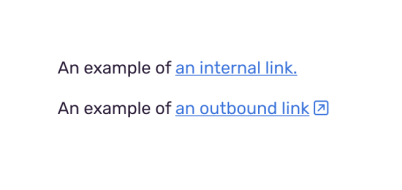
…but on this here website, Kiko Beats had added the website’s favicon to the beginning of each link like this:

This is neat! Although, I do tend to read one of those links as walternating current there because of the white background of the Wikipedia favicon. So maybe it’s best to move the favicon to the end? Not sure what the solution there is but I still think this is interesting! Zach Leatherman then went on to explain that the technique was using an icon font (which is generally not advised today) and instead he created IndieWeb Avatar which lets you use the favicon from a website, like this:
a[href^="https://twitter.com"]:before {
  content: "";
  display: inline-block;
  vertical-align: text-bottom;
  width: 1em;
  height: 1em;
  margin: 0 .2em;
  background-size: contain;
  background-image: url("https://v1.indieweb-avatar.11ty.dev/https%3A%2F%2Fwww.twitter.com%2F/");
}
That’s…extra neat! Just put it in the indie web avatar URL and the website and it’ll do the rest for you.
:where() can be overwhelming at first
I agree with Manuel Matuzovic here, the new :where CSS pseudo-class is a bit confusing when you read examples about how to use it. His example makes a ton of sense though:
ul:where([class]) {
  list-style: none;
}
…this is the same as writing the following…
ul[class] {
  list-style: none;
}
Which means “any <ul> with a class, remove the list style.“ Pretty straightforward stuff. All that where() does above there is make the specificity of the rule 0. All that means is that it’s now easier to override basically anything else in CSS.
This is why Elad Shechter has used this pseudo-class liberally in his new CSS reset, with one example being this bit:
:where([draggable="true"]) {
  -webkit-user-drag: element;
}
I feel like maybe in the future we should make it an unspoken to only use :where in the context of resets or default styles for HTML elements? Otherwise, I can definitely see their usage being pretty confusing.
Fluid type sizes and spacing
I’m not sure how popular the “fluid type” method is these days but the idea is this: with CSS we set a min and max font-size for our elements so that we don’t have to have a billion media queries for each individual change we might want to make.
Today we can do this with the clamp() function like this:
h1 {
  /* font-size: clamp(min, ideal, max); */
  font-size: clamp(20px, 10vw, 200px);
}
That middle value there is the ideal value and we’re using a vw unit there to tell the browser that ideally the font-size should respond to the width of the browser (in this case, try to have a value that’s 10% of the width, so if the browser window is 1000px wide, then have a font-size of 100px). Once it hits 200px it’ll stop, and if it gets smaller it’ll stop at 20px.
Here’s a demo where you can play around with the values to get a feel for it.
Nothing shocking here, this stuff has been available for a while but I really like this idea a whole lot! So it was great to read this post from Piper Haywood all about how she sets type using Sass and CSS custom properties because I think it adds something new to this technique. Piper uses the looping powers of Sass to create the min and max font-size of every heading element and uses them to create a custom property for each of them.
First off, Piper sets the ideal heading sizes in a Sass variable:
$ft-sizes: (
  h1: 30,
  h2: 26,
  h3: 20,
  h4: 16,
  small: 12
);
Okay, weird. Why wouldn’t we do that with custom properties now though? Well, Piper shows us why by looping over them like this:
:root {
  @each $name, $size in $ft-sizes {
    @include sizeVar($name, $size);
  }
}
That sizeVar() function does some neat magic:
@mixin sizeVar($name, $size) {
  $proportion: $size / $ft-body;
  $min: $ft-body-min * $proportion;
  $max: $ft-body-max * $proportion;
  $vw: $ft-body-vw * $proportion;
  --ft-size-#{$name}: clamp(#{$min}, #{$vw}, #{$max});
}
I’d translate this to: “take two these two numbers and then create a custom property with a fluid type clamp() based on a proportion relative to the size of the heading.” That sounds like a lot but hang on.
All of this means we can then use these variables like this:
h1 {
  font-size: var(--ft-size-h1);
}

h2 {
  font-size: var(--ft-size-h2);
}
We now have a fluid typographic scale that we can use across all our typographic elements and they’ll all scale in proportion to one another without having to have a million confusing clamp() functions all over the place. It reminds me that Sass is amazing because I’d never think of something like this.
Also, even if all this magical Sass stuff here might seem a bit intense I think the real important thing to remember is this: we shouldn’t set type in pixels, but in proportions instead.
The New WebPageTest UI
WebPageTest is a dang useful tool for figuring out how slow your website is and so it was great to read about an update to the interface.

A great tool now has a great UI to go with it. I quickly ran a side project URL through it and it’s all so much slicker and easier to read now. Oof, also that side project clocks in at a 3.1 second start render.
Please excuse me whilst I go delete everything on that website.
clay.css
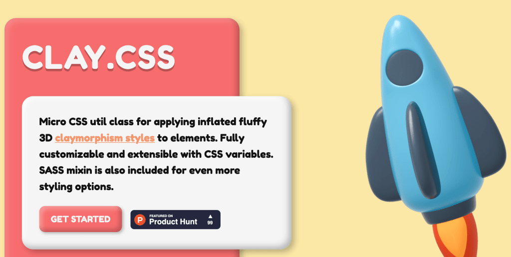
I love this effect I’ve seen in 3D art circles but I didn’t know it was called claymorphism. Well, here’s a handy micro CSS utility class called clay.css that immediately turns your regular ol’ box components into something with a bit more depth and oomph like this:
Sponsor
axe DevTools
Are you testing for accessibility? If not, your website could be inaccessible to people with disabilities.
The axe DevTools browser extension was created to help dev teams easily find and fix accessibility bugs without requiring special knowledge. Get started for free.
@media (pointer: coarse)
For the last link this week, Josh Comeau reminded me earlier this week that this media query exists:
.button {
  min-height: 32px;

  @media (pointer: coarse) {
    min-height: 48px;
  }
}
It detects if the browser is using a touch screen or not so this allows us to target mobile and tablet devices where clicking things is harder with a stubby ol’ finger. But the real magic of Josh’s technique here is when he uses a variable to do all this hard work for us, like this:
:root {
  --min-tap-target-height: 32px;

  @media (pointer: coarse) {
    --min-tap-target-height: 48px;
  }
}

.button {
  min-height: var(--min-tap-target-height);
}

.text-input {
  min-height: var(--min-tap-target-height);
}
Gah! That’s so smart that I’m annoyed I didn’t think about this. It makes our CSS so much more systematic and clean across the board.

Sponsor
Jetpack Licensing for Agencies and Professionals
Jetpack has solved a classic WordPress question: who should purchase the plugin license, the developer or the client? Well, that’s no longer an issue with Jetpack licensing options for agencies and professionals. Now, you can bundle Jetpack licenses for all of your clients’ WordPress sites in one account. This way, you only get one invoice for all of the licenses rather than an invoice for each and every client license.
Plus, you’ll gain access to Jetpack’s easy-to-use license management tools and receive 25% off all of our products. All you need is to sign up and issue 5 licenses within 90 days.
[Chris]: This seems like a pretty important thing to know:

The npx thing is an npm utility that means you can use things off npm without having to install them. So here you’re using benny-hill like it’s a CLI thing, but it’s on-the-fly. This CLI just executes whatever commands it finds after it, while playing the Benny Hill theme, obvs. It ain’t much code, in case you’re interested in learning how something like that might work.
