I have a coworker who is smart, capable, and technologically-literate. Like me, they work on the web full-time.
When they are sharing their screen in a meeting, I find myself disassociating fixating on the red update button in their copy of Chrome.

Clicking this button would start the process to update Chrome to the latest stable version.
I’ve asked some probing questions about how frequently they reboot, which would also force Chrome to update upon relaunch. That’s the point of an “evergreen” browser, right? It’s easy to make sure you’re always using the latest and greatest version.
It turns out they prefer to wait until they absolutely have to because of the disruption it would cause in their daily workflow. Their behavior makes sense. They are prioritizing the quality of their overall computing experience, rather than catering to the demands of one specific app.
Like me, my coworker also uses a top-of-the-line laptop to get things done. This means that the laptop can go for months without needing a reboot. Ironically, this might be a situation where a craptop is conditionally forced to have a faster browser upgrade path.
Evergreen browsers
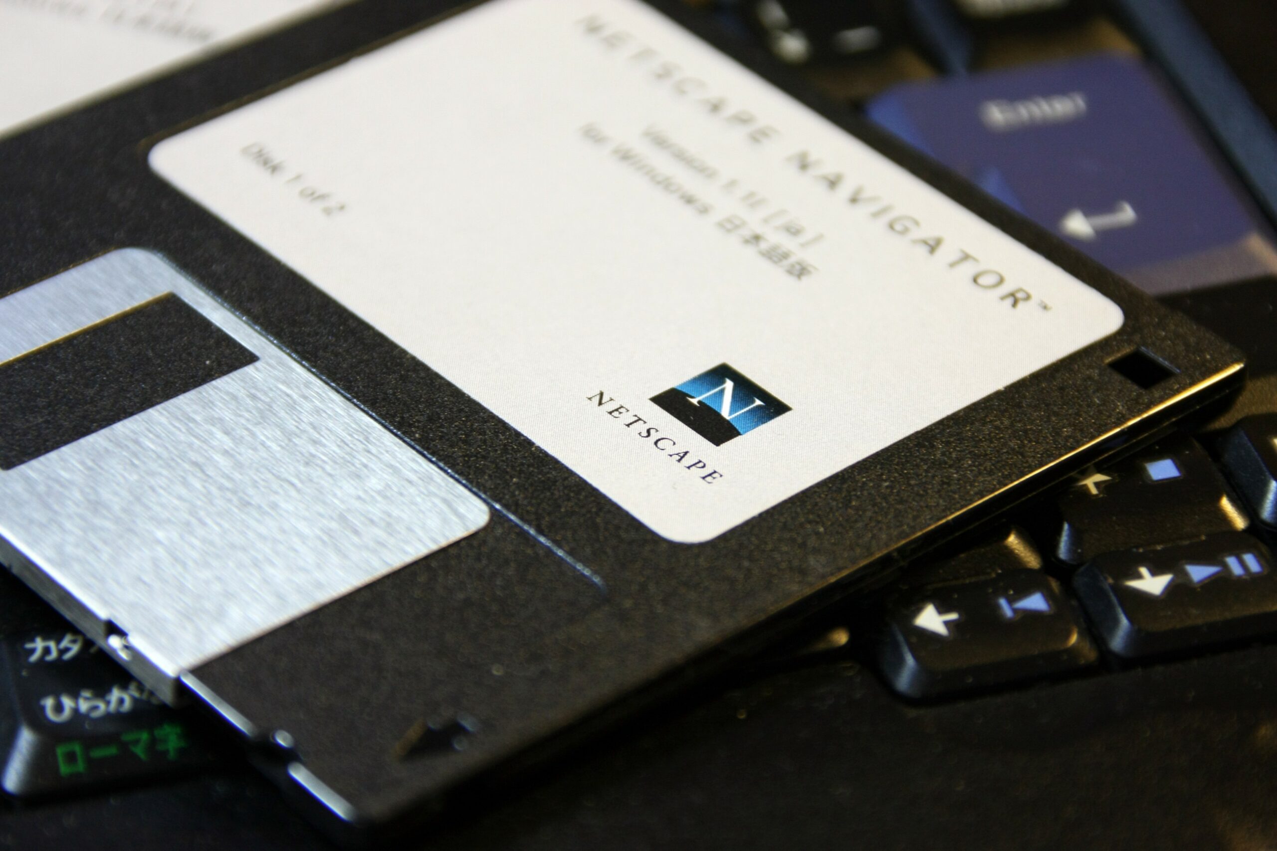
Before the advent of evergreen browsers, you would need to go to the manufacturer’s website and manually download and install the update. Prior to that you had to use a CD or floppy disk.

By contrast, an evergreen browser is any browser that can automatically update itself. By this, I mean the browser will automatically pull down the code required to add new features and fix bugs once it has been released by the browser’s manufacturer. The update itself occurs with:
- a prompt shown to the person using the browser that triggers an application restart,
- a download that happens in the background and gets applied on application restart, or
- on device restart.
The browsers themselves
Nearly all major browsers are evergreen. This includes Google Chrome, Microsoft Edge, and Mozilla Firefox.
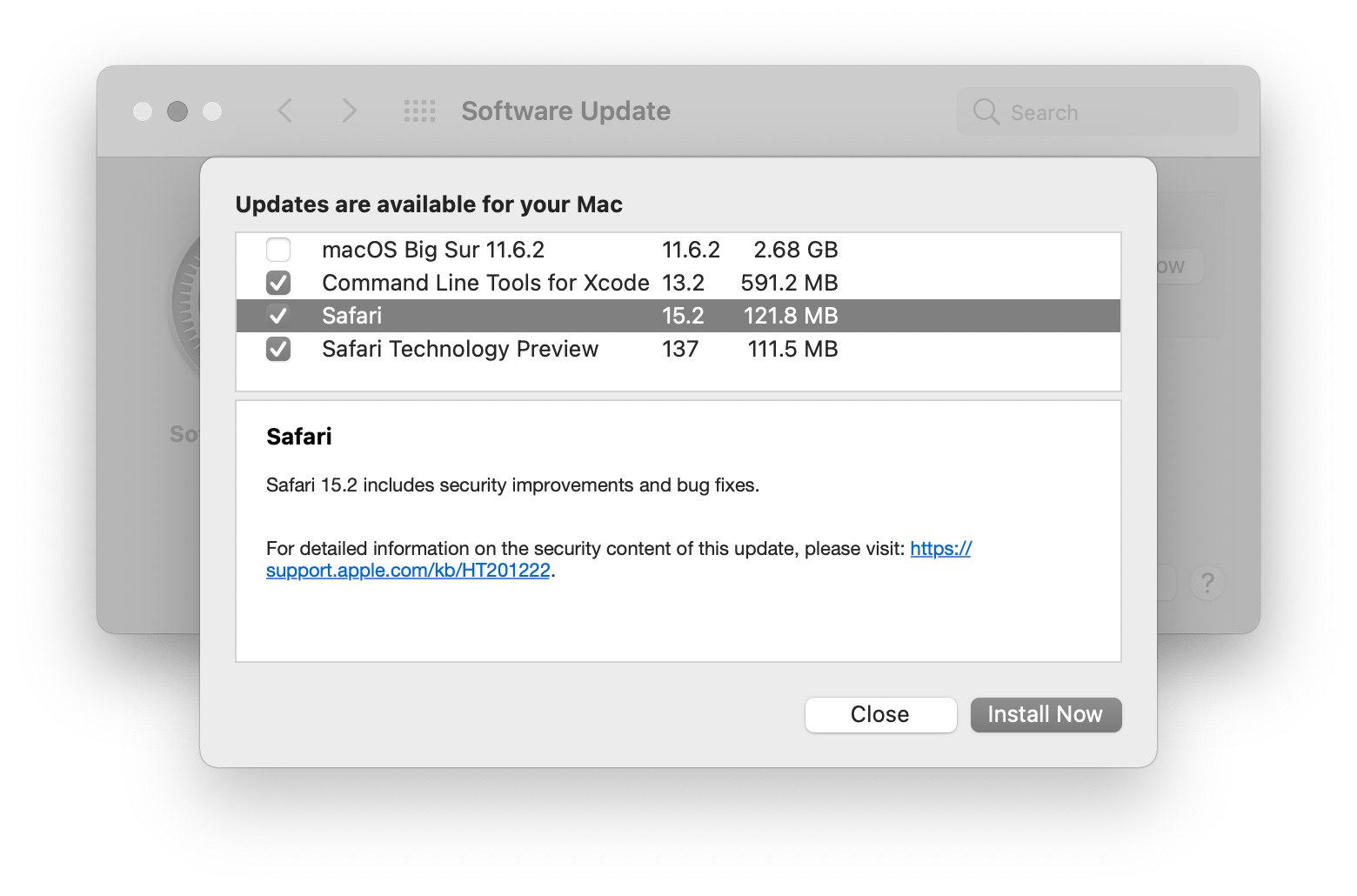
Apple Safari is quasi-evergreen. By this I mean it automatically receives updates, but awkwardly requires them to be done via the macOS operating system update interface, where other system-wide updates are located.

If you haven’t been paying attention, the Safari team has been making a ton of improvements to their browser in the past few months—I’d love to see them continue with this trend by making the browser update path decoupled from existing macOS and iOS upgrade workflows.
The situation
With the actual, final, no-seriously-we-mean-it-this-time death of Internet Explorer, evergreen browsers are now the main consideration for desktop and laptop browsers. This is great! It means we can spend a lot less time fretting about who can use what.
Spending less time does not mean spending no time, however.
Delayed effects
Support from all evergreen browsers on caniuse.com does not necessarily mean support exists on the device a person is using—updates that have been pushed out don’t automatically get instantly applied.
Because of these two factors, I advocate for tempering your excitement with some restraint. It can be very tempting to rush and use the new and the shiny. Believe me, I’m not exempt from this urge—CSS is about to go from great to amazing, and the urge to use new features is very real.
Instead, wait a bit. Work with the platform’s ability to create progressively enhanced experiences with CSS and JavaScript.
Leverage the platform
The web is really good at being resilient, provided you work with its grain.
Both CSS and JavaScript have the ability to conditionally serve up experiences for browsers that support new features while providing alternatives for those that don’t.
Instead of looking at the support table for something on caniuse.com and thinking, “I wish more browsers supported this feature so that I could use it!”, you can instead think “I’m going to use this feature today, but treat it as an experimental feature.”
—Jeremy Keith, “Continuous partial browser support”
JavaScript
You can use JavaScript to query whether or not a browser supports a certain feature. For example, the Navigator interface provides a mechanism for querying a user agent’s capabilities.
if (!(“geolocation” in navigator)) {
  // Logic if a user's current geographic location isn't available
} else {
  // Logic that is based on a user's current geographic location
}
In this example, I am inverting a request for support for a browser’s Geolocation interface. Although its syntax is initially a little confusing to parse, it helps emphasize a progressive enhancement approach.
Assume geolocation functionality isn’t supported to start and provide a way to accommodate the person using this browser (say manually typing in a ZIP Code, etc.). With this use case covered, you can then confidently build an experience for browser that support geolocation.
This thinking also extends to all other browser features and capabilities.
CSS
Like most other programming languages, CSS also lets us use if-like statements.
For example, the @supports at rule allows you to create a conditional statement that targets whether or not a browser supports something, and then apply logic to it. Browsers that honor the feature will utilize those styles, and browsers that don’t will ignore them. It is a concise, clever, adaptable solution.
.component {
  /* Base appearance */
}

@supports (grid-template-columns: subgrid;) {
  .component {
    /* Styling and positioning enhancement tweaks if subgrid is supported */
  }
}
For this example, this progressive enhancement approach ensures that a component’s content and functionality is preserved for every browser, but only creates fancy layouts for browsers capable of supporting them.
When can I remove this stuff?
Yes, this approach adds more code, and more code means more complexity and maintenance. But it’s very important code. You might even call it technical debt and you’d be correct. But technical debt can be a good thing, like an investment in the future.
You may want to remove that complexity when it’s no longer needed. Knowing the right time to do that in this age of evergreen browsers is difficult, but I have a couple of suggestions:
Patience is a virtue
In terms of waiting, I’d advise a conservative 6-ish months from release of a new feature before even beginning to think about investigating if you can remove feature detection. This accounts for:
- Reboots
- Update procrastinators
- Update avoiders
- Hardware refresh cycles
- Corporate update policies,
- etc.
I would also say that rough six month timeframe is in terms of a general, global web audience. This guesstimate changes if you cater to a specialized audience. The way to know who you actually serve? Analytics, yes, but also talking to people.
Maybe don’t
Remember: survivor bias is real. Is the brand new feature you’re using preventing someone from using your website or web app? I say this because some people:
- are forced to use a device that is managed by a third party,
- deliberately avoid updating their hardware and software for fear of losing the ability to interact with the world,
- understand their device is the problem, but don’t have the knowledge for how to fix it, and
- use “dead” evergreen browsers, devices that used to receive browser updates, but are no longer supported by their manufacturer.
There isn’t a single, specific device, browser, and person we cater to when creating a web experience. Websites and web apps need to adapt to a near-infinite combination of these circumstances to be effective. This adaptability is a large part of what makes the web such a successful medium.
Consider doing the hard work to make it easy and never remove feature queries and @supports statements. This creates a robust approach that can gracefully adapt to the past, as well as the future.
The future is uncertain
We’re long past the age of desktop computers. Browsers are showing up in more and more places: phones, tablets, watches, ebook readers, digital cameras, kiosks, televisions, home assistants, vending machines, photo frames, graphing calculators, ATMs, point of sale terminals, exercise equipment, video game consoles, billboards, refrigerators, virtual reality, and cars.
Who knows what devices browsers will be included with in the future, or what capabilities they’ll have? Future-proof (and, er, past-proof) yourself with an approach that accommodates it.
Thank you to to Jim Nielsen for their feedback.

What about all the other browsers? Why only focus on Safari?
Cuz Safari is the new IE?
“It turns out they prefer to wait until they absolutely have to because of the disruption it would cause in their daily workflow.”
What s***y workflow do they have if a 30 second restart disrupts their daily workflow? Don’t they take breaks? If they are not monitoring a nuclear reactor, this explanation doesn’t make any sense.
And yet.
Well there are various reasons…
Browser updates don’t always work as expected. When you are doing a presentation, I strongly encourage to disable your updates. I’ve seen it more then once when something suddenly doesn’t work. Not possible? Chrome plans remove alert(). Firefox and Chrome disabled TLS 1.0 quite recently (and obviously some sites were not ready, some still aren’t).
When you have many tabs this not a 30 second restart. My wife has literally more then 100 tabs open. Restarts are slow as you can imagine (she uses Chrome).
You might loose your work. When you have many open tabs you might forget to save. And webpages don’t always save drafts or warn before closing tabs.
You loose your sessions. Tabs can be restored but session cookies are removed (HTTP sessions are removed too). You might need to re-authenticate to various sites after restart.
Hibernation. Some people just hibernate their computers. I do. That way everything is ready when you need it. Even if I don’t have that many tabs I can have a browser open for months.
So yes, unfortunately this is not as easy as it seems.
“By this I mean it [Safari] automatically receives updates, but awkwardly requires them to be done when updating the macOS operating system with other system-wide updates.”
Worth nothing, as a nuance, is that you don’t need to perform the macOS update in order to get the Safari update. This is also reflected in your screenshot: you can uncheck the macOS update checkbox. Because of this decoupling, older macOS versions (which might no longer be updated) can also receive Safari updates nowadays. This wasn’t always the case though, hence the confusion.
On iOS it’s an entirely different story, unfortunately. AFAIK, there, the Safari version updates are still tightly coupled with the iOS version updates.
There are standalone updates for Safari but they are only available for the previous two major versions of macOS. For instance, Safari 13 (released with macOS 10.15) is only available for macOS 10.14 and 10.13. (The Safari 15 release notes don’t specifically say, but according to Wikipedia it is not available for macOS 10.14 or older.)
I think many devs forget how many users are mobile-first or mobile-only, more for some sites than others. Which has a slightly different evergreen browser update model.
The macOS limitation on evergreen generally applies on iOS/iPadOS (especially since all browsers on iDevices are Safari).
On Android, many users disable the Google Play Store from auto-updating apps. After being burned when their favorite apps munge the UI or kill features, they are more cautious. These users are not updating their browser as much as a result.
Gathering anecdata from a half dozen Android users I know, their Chrome and Firefox versions averaged 10 versions behind.
On my own site, when I look at just browser versions and then compare mobile versus not, the older versions (70s and 80s) tend to more prevalent on mobile (with the 30s on desktop, perhaps owing to web views).
While we’re on the topic of browser versions, it should be kept in mind that many web browsers have LTS versions available with slower update cycles (such as Firefox ESR). Some users – even outside of enterprise workloads – deliberately choose such browsers to maximize stability and avoid running into regressions.
I often just don’t want the disruption and wait til Chrome’s button is red before updating. Can’t find the link, but I also saw something recently about Chrome being limited by OS version on Chromebooks, similar to Safari.