I got this exact question in an email the other day, and I thought it would make a nice blog post because of how wonderfully satisfying this is to do in CSS these days. Plus we can sprinkle in polish to it as we go.
HTML-wise, I’m thinking image, text, image, text, etc.
<img src="..." alt="..." height="" width="" />
<p>Text text text...</p>

<img src="..." alt="..." height="" width="" />
<p>Text text text...</p>

<img src="..." alt="..." height="" width="" />
<p>Text text text...</p>
If that was our entire body in an HTML document, the answer to the question in the blog post title is literally two lines of CSS:
body {
  display: grid;
  grid-template-columns: min-content 1fr;
}
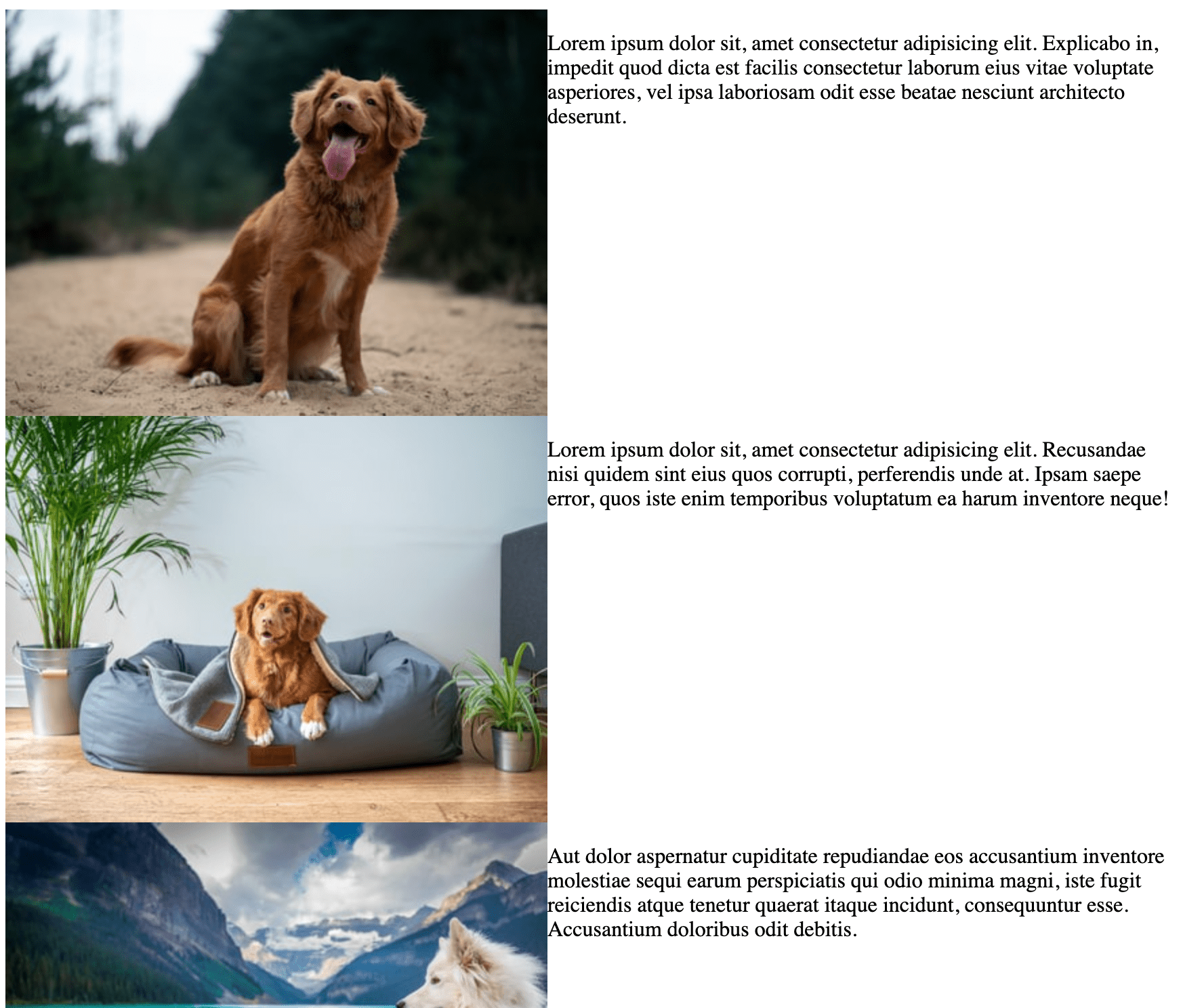
It’s going to look something like this…

So cool. Thanks CSS. But let’s clean it up. Let’s make sure there is a gap, set the default type, and reign in the layout.
body {
  display: grid;
  padding: 2rem;
  grid-template-columns: 300px 1fr;
  gap: 1rem;
  align-items: center;
  max-width: 800px;
  margin: 0 auto;
  font: 500 100%/1.5 system-ui;
}
img {
  max-width: 100%;
  height: auto;
}
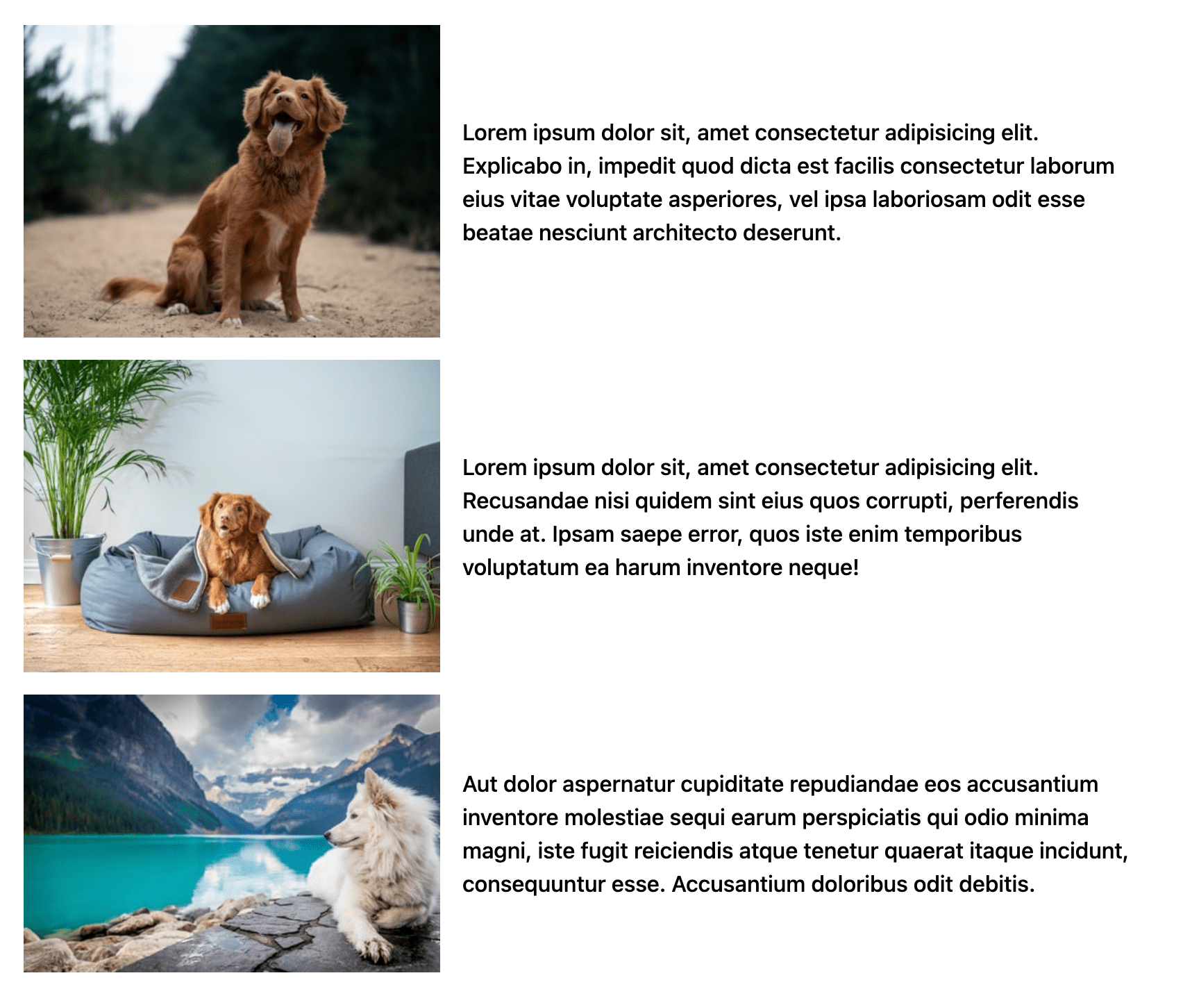
I mean… ship it, right? Close, but maybe we can just add a quick mobile style.
@media (max-width: 650px) {
  body {
    display: block;
    font-size: 80%;
  }
  p {
    position: relative;
    margin: -3rem 0 2rem 1rem;
    padding: 1rem;
    background: rgba(white, 0.8);
  }
}
OK, NOW ship it!

Eh… use figure and figcaption, maybe? So the text can be related to the image?
If the text is connected to the separate images, wouldn’t this be a good usecase for figure and figcaption?
Something along the lines of:
But then the grid layout needs to be redefined
ya maybe. If the text is very literally a caption for the image, sure. I wouldn’t say it always has to be (thinking of a list of features where the image is just an arbitrary icon or screenshot or something, and the text isn’t really a caption for it.)
Once you have a wrapper like that “in the way”, this becomes a compelling reason that subgrid exists!
You can also add a box-shadow:20px 15px green;
to put a drop shadow on an image. Only if it looks good.
Have you ever thought about the fact that if we use a negative margin on the elements that reside below the replaced elements (e.g.
<img>) like as in this particular example, we have to create a new stacking context for the element that we use a negative margin on? Otherwise the background of the<p>will be below the<img>tag.As in this case, we have to add
position: relative;(or it can beopacity: 0.99;, etc…) to the<p>even though it locates below the image in the DOM.On the other hand, if we change the
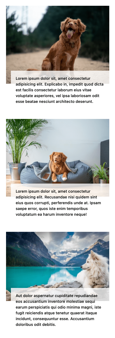
<img>to, say,<div>in won’t be necessary and we can use negative margin without creating a new stacking context.I thought the purpose of the mobile styles (in this case) was to create a stacking effect between the image and the corrosponding paragraph? So in this case should a new stacking context reasonable?
Thank you Chris,
This is exactly what I was looking for. I typically make pages that describe backpacking excursions in our Sierra Nevadas, with lots of images (some of which I can click on to expand), and with each image, provide a paragraph or two of text. So your nice clear example is just right!
Hi Chris – I found this thread because I’ve been looking for a way to link text blocks to certain features of an image. Hard to explain, but I saw the effect in a NY Times piece and wondered how easy/hard it would be to achieve. Is this something I’d need to code or perhaps there is an existing solution? Here’s the link if you have ideas, and thank you! https://www.nytimes.com/interactive/2021/04/02/arts/design/shah-jahan-chitarman.html
How would you do this if you had the same design but wanted a header above the paragraph as well?
<img src="..." alt="..." height="" width="" /><h1>Header text!</h1>
<p>Text text text...</p>
Might try putting the heading and paragraph together in a wrapper, then apply the existing paragraph styles on the wrapper.
I applied it on my blog and it works. However, the background doesn’t function. I had to adjust the margin from -3 to 0rem and justified the text. I have tried presenting my quotes in different forms to favor my blog visitors but I think applying this grid form is a nice idea. I only had difficulty with the because in blogger, once you tag the body, the CSS would affect an entire blog. I had to use a class and id to effect the code. Thank you so much for sharing this.