With all the excitement around CSS Grid, I haven’t seen as much talk about the new fr CSS length unit (here’s the spec). And now that browser support is rapidly improving for this feature, I think this is the time to explore how it can be used in conjunction with our fancy new layout engine because there are a number of benefits when using it; more legible and maintainable code being the primary reasons for making the switch.
To get started, let’s take a look at how we’d typically think of building a grid in CSS. In the example below, we’re creating a four column grid where each column has an equal width:
<div class="grid">
<div class="column"> </div>
<div class="column"> </div>
<div class="column"> </div>
<div class="column"> </div>
</div>
.grid {
display: grid;
grid-template-columns: repeat(4, 25%);
grid-column-gap: 10px;
}If you’ve never seen that repeat() function after the grid-template-columns property then let me introduce you to one of the neatest features of CSS Grid! It’s a shorthand, essentially, allow us to more succinctly describe repeating values. We could have written grid-template-columns: 25% 25% 25% 25%; instead, but it’s cleaner using repeat(), particularly when you have more verbose widths (like a minmax() expression).
The syntax is essentially this:
repeat(number of columns/rows, the column width we want);There are actually a couple of issues with what we’ve done so far, though.
First, in order to use this neat CSS function, we had to do a tiny bit of math. We had to think to ourselves what is the total width of the grid (100%) divided by the number of columns we want (4), which brings us to 25%. In this instance, the math is pretty darn easy so we don’t have to worry about it but in more complex examples we can completely avoid doing the math and let the browser figure that out for us. We do have calc() available to us, so we could have done repeat(4, calc(100% / 4), but even that’s a little weird, and there is another problem anyway…
The second issue is a problem with overflow. Because we’ve set each column to 25% and a grid-column-gap to 10px then that pushes grid element wider than 100%. It isn’t how you’d expect things to work from just looking at the code above but that’s how percentages work. What we’re really saying with the code above is “set each column to 25% the width of the viewport and have a 10px gap between them.” It’s a subtle difference, but it causes a big issue with layout.
We’ve inadvertently caused some horizontal scrolling here:
This is where the fr unit can help us.
The fr unit (a “fraction”) can be used when defining grids like any other CSS length such as %, px or em. Let’s quickly refactor the code above to use this peculiar new value:
.grid {
  display: grid;
  grid-template-columns: repeat(4, 1fr);
  grid-column-gap: 10px;
}That will look just the same as the example above because in this instance we’re setting each of our four columns to one fraction (which happens to be 1/4 or 25%). But! There’s no overflow on the x-axis anymore because setting each column to 1fr takes that 10px into account automatically and subtracts it from the total width available for each column.
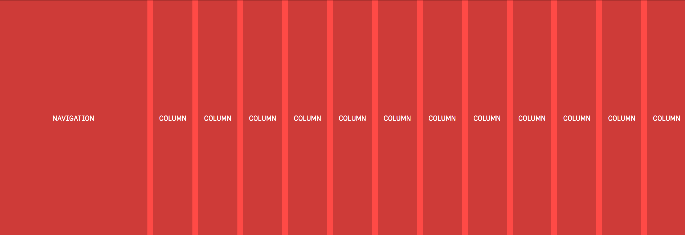
Why the heck should I learn how to use this fancy new CSS length if I can mostly stick to the units like percent or pixels, you wonder? Well, let’s dig into a more complex CSS Grid example to explain why fr is a better alternative. In a new example, let’s say we want our navigation on the left followed by a twelve column grid which should look like this:

This is a pretty typical scenario for a lot of UIs and so using the fr unit prevents us from either making a separate grid div or fumbling about with calc. Because if we didn’t use fr in the example above then we’d somehow have to figure out the following:
the width of each column = ((width of viewport - width of nav) / number of columns) * 1%That’s possible for sure, it’s just awfully painful to read, and if we changed the width of the nav then we’d have to do that dumb calculation all over again. Instead, the fr unit tidies all of that up into a super readable line of code:
.grid {
  display: grid;
  grid-template-columns: 250px repeat(12, 1fr);
  grid-column-gap: 10px;
}What we’re doing here is setting a fixed width in pixels for the first column and then creating twelve separate columns which are set at one “fraction of the free space” (literally how the spec phrases it). But there’s no crazy calculations or anything! It’s super readable and if the width of that left nav changes then the width of our columns on the right will adjust themselves automatically.
With just a little bit of legwork we’ve made our interface more maintainable for the future and we’ve ensured that our code is more legible for the next developers that are coming up behind us.
Information from other folks
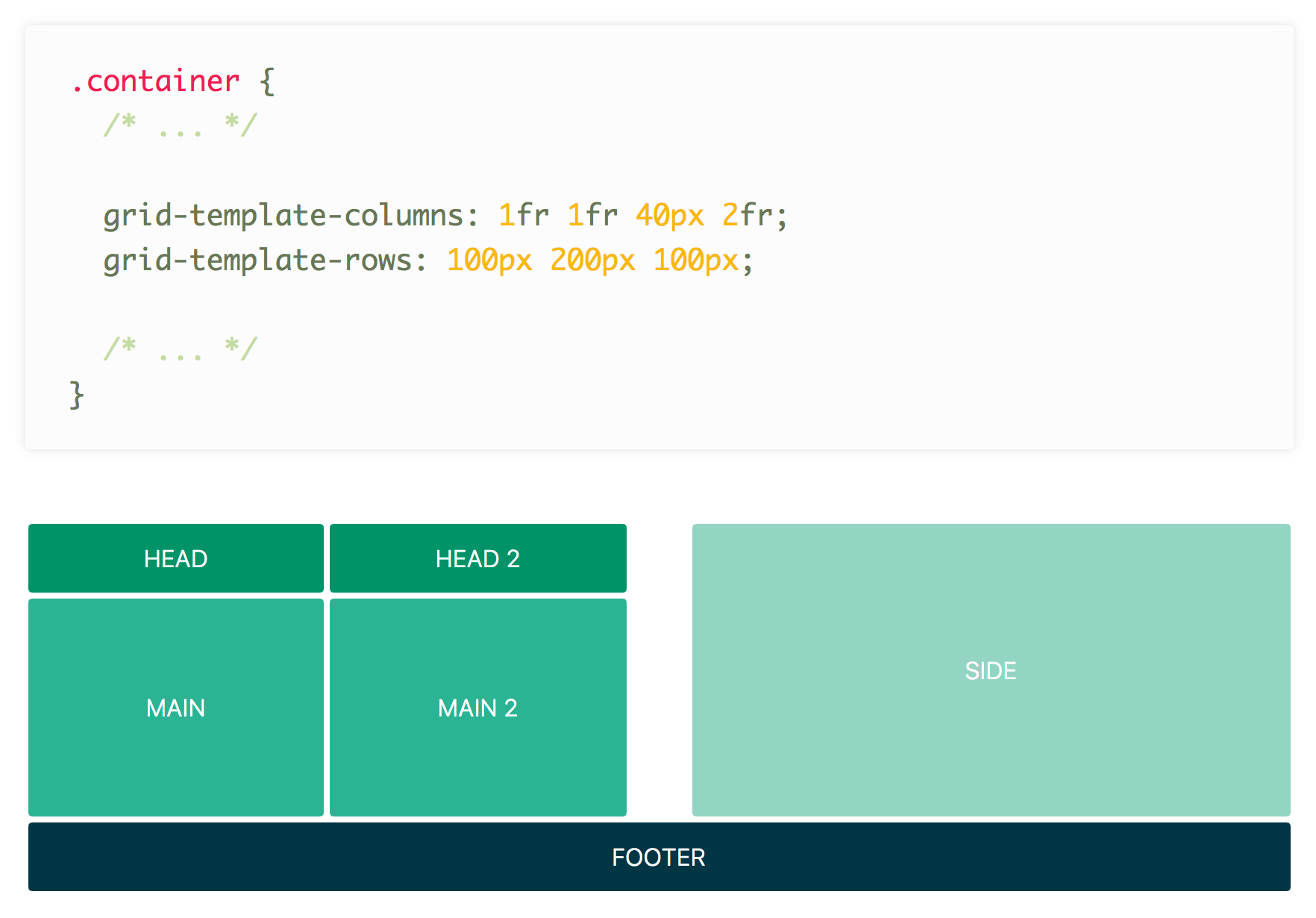
Some of the fun and power of the fr unit comes from mixing it with other units. Imagine a fixed sidebar and main content area that takes up the rest of the space: grid-template-columns: 200px 1fr; easy!
Here’s an example from DigitalOcean showing mixed units nicely:

Rachel Andrew has a video specifically about fr:
Anna Monus has a very good article on fr.

Yay for the fr unit!

Amazing! Does anybody have a caniuse.com link to this so I can see current browser support?
It only works (for now?) in conjunction with Grid layout, so: http://caniuse.com/#feat=css-grid
Is there an easy rule of thumb for using fr to get columns and rows to be golden ratio? Not sure if that quite makes sense, but the a:a+b rule comes up a lot in visual design recommendations, so curious if fr unit lends itself easily to such proportion goals.
Thanks, I just started using grid in admin tools about a month ago, and the fr unit was a bit ambiguous to me. This was a great overview. fr ftw!
Not unlike Flexbox’s proportionate sizing!
Indeed! I wonder if flexbox could go back in time if they would use
frinstead of unitless numbers, or not.What I’d like to have is the support of the
frunit in context other than the usual grid layout. This unit can also replace theflex-growproperty, but more in general it could be adapted in other cases.Is it incorrect of me to think of the fr unit as the “flex-grow property” for grid? Setting flex-grow: 1 has a similar effect – take up the available free space but divvy it amongst other flex-grow’ers. I’m curious if there’s any subtle differences I’m missing.
Very nice and interesting article about the grid unit and looking forward to be using it more, even in production :)
I hope the
frunit comes out of the grid layout and becomes a regular unit, likepx,%etc.Has anyone adopted CSS-Grid yet? Is lack of opera mini support a big deal?
The spec you linked to has a Note saying that
fris not a length unit, but a flexible length unit, which is technically a different type of dimension, specific for Grid Layout. It can’t be combined with ordinary length units viacalc()function (i.e. things likecalc(1fr - 2em)are not allowed).And yes, the CSSWG members admit that Flexbox flex factors are in fact flexible lengths, too, and should be measured in
frinstead of bare numbers: https://wiki.csswg.org/ideas/mistakes.