Articles Tagged
responsive
Avoiding the Pitfalls of Nested Components in a Design System
When creating a component-based, front-end infrastructure, one of the biggest pain points I’ve personally encountered is making components that are both reusable and responsive when there are nested components within components.…
Responsive Layouts, Fewer Media Queries
We cannot talk about web development without talking about Responsive Design. It’s just a given these days and has been for many years. Media queries are a part of Responsive Design and they aren’t going anywhere. Since the introduction of …
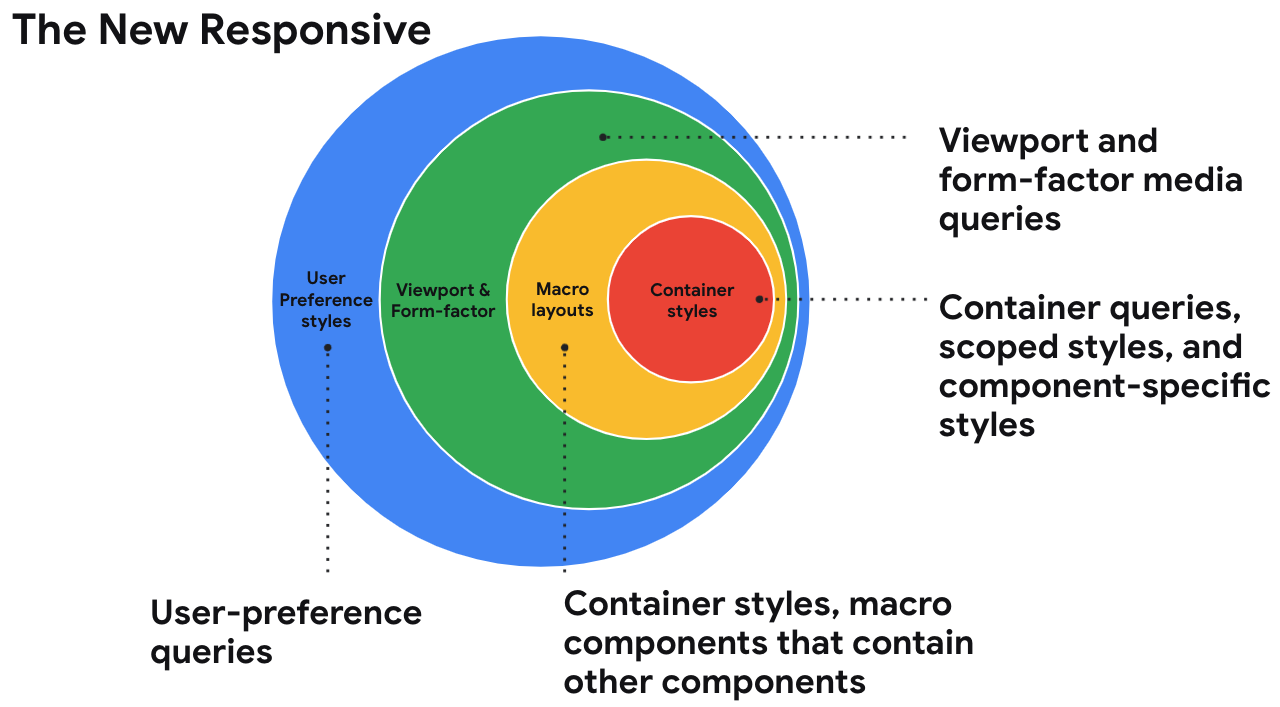
Are we in a new era of web design? What do we call it?
Una is calling it the new responsive. A nod to the era we were most certainly in, the era of responsive design. Where responsive design was fluid grids, flexible media, and media queries, the new responsive is those things …
Intrinsic Typography is the Future of Styling Text on the Web
The way we style text hasn’t changed much over the years. There have been numerous advancements to help make things more flexible, like layouts, but in terms of styling, most finite aspects of our designs, like text, remain relatively unchanged. …
Use CSS Clamp to create a more flexible wrapper utility
I like Andy’s idea here:
.wrapper {
  width: clamp(16rem, 90vw, 70rem);
  margin-left: auto;
  margin-right: auto;
  padding-left: 1.5rem;
  padding-right: 1.5rem;
}
Normally I’d just set a max-width there, but as Andy says:
…This becomes a slight issue in mid-sized viewports, such
The Raven Technique: One Step Closer to Container Queries
For the millionth time: We need container queries in CSS! And guess what, it looks like we’re heading in that direction.
When building components for a website, you don’t always know how that component will be used. Maybe it …
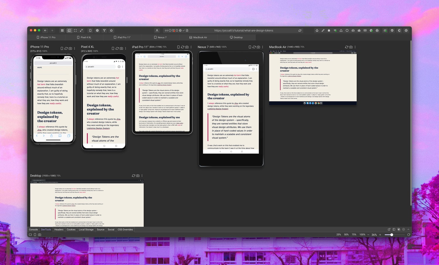
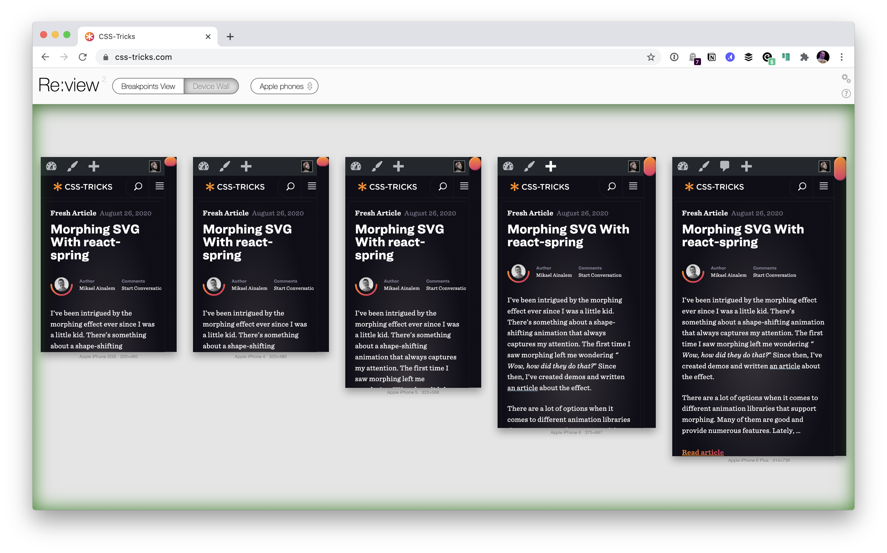
Comparing Browsers for Responsive Design
There are a number of these desktop apps where the goal is showing your site at different dimensions all at the same time. So you can, for example, be writing CSS and making sure it’s working across all the viewports …
How to Make a Media Query-less responsive Card Component
Fun fact: it’s possible to create responsive components without any media queries at all. Certainly, if we had container queries, those would be very useful for responsive design at the component level. But we don’t. Still, with or without …
Responsive web design turns ten.
Ethan on the thinking and research that inspired the term:
…Around that time, my partner Elizabeth visited the High Line in New York City shortly after it opened. When she got back, she told me about these wheeled lounge chairs
Turning a Fixed-Size Object into a Responsive Element
I was in a situation recently where I wanted to show an iPhone on a website. I wanted users to be able to interact with an application demo on this “mock” phone, so it had to be rendered in CSS, …


